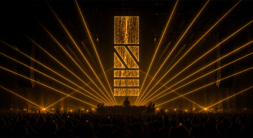
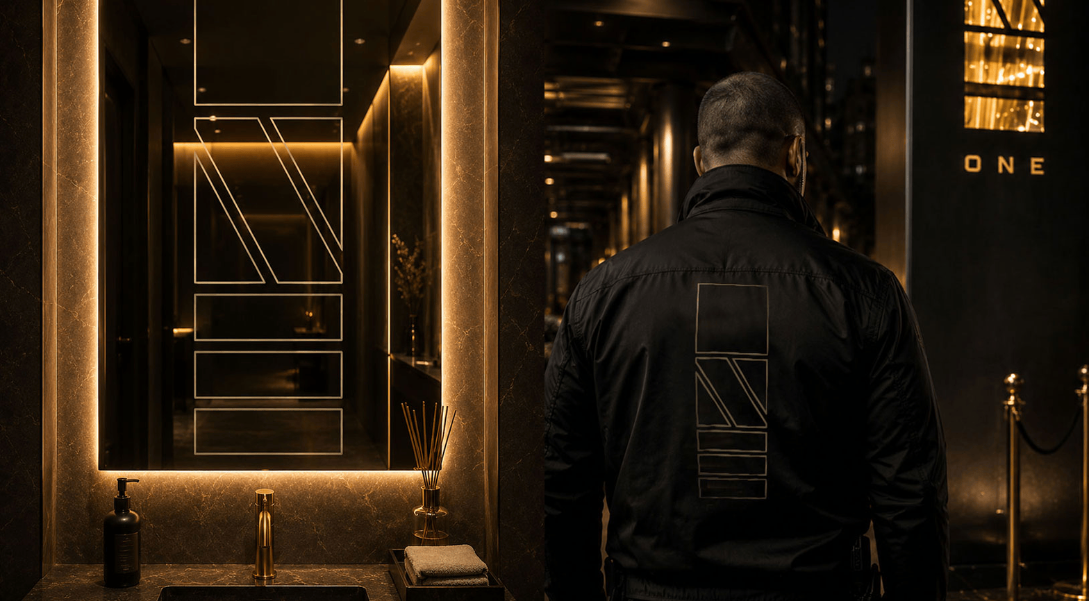
ONE is a nightclub in Montreal built around a single idea: exclusivity doesn’t need to shout. The name says it all before the logo even does. One night. One room. One standard. The brand needed to feel like a place worth being chosen for, not just a venue with good sound and better lighting. Every surface, every post, every piece of signage had to carry that same sense of restraint and confidence.
The Brief
Montreal already has no shortage of nightlife. What it didn’t have was a club that treated its identity with the same precision as a luxury house. The goal was to build a system that could hold its own against that level of polish while still working as a nightclub brand that is flexible enough for a different party every weekend, disciplined enough to always look like ONE.
The Logo
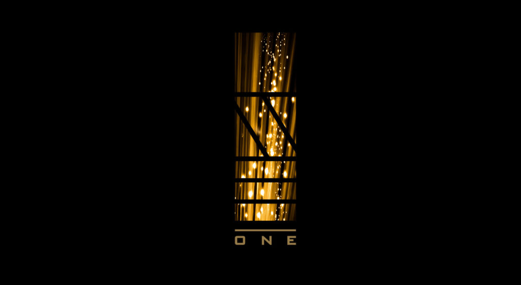
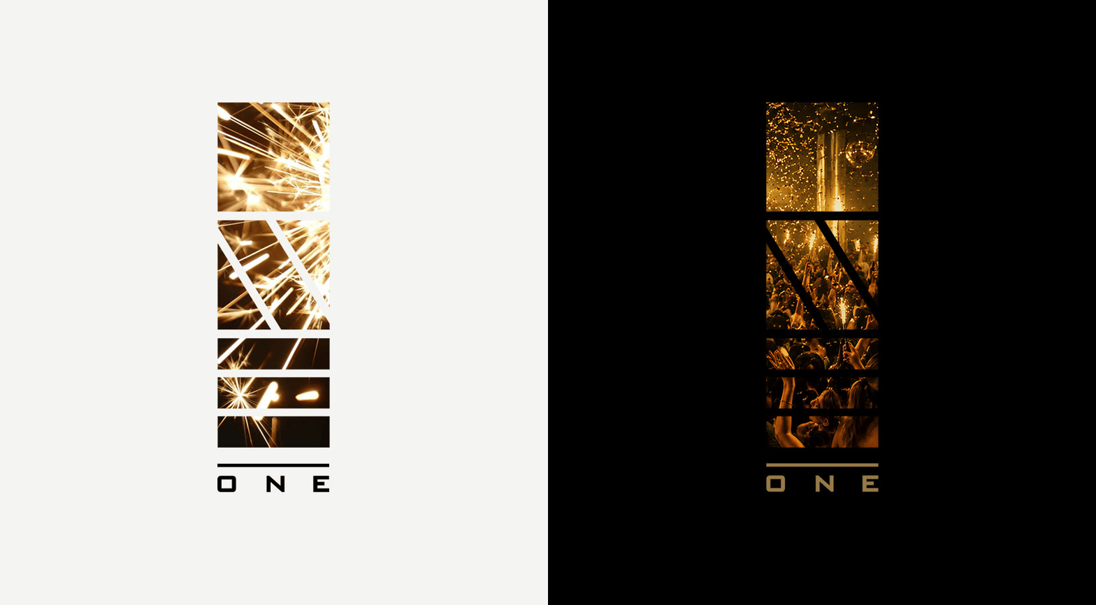
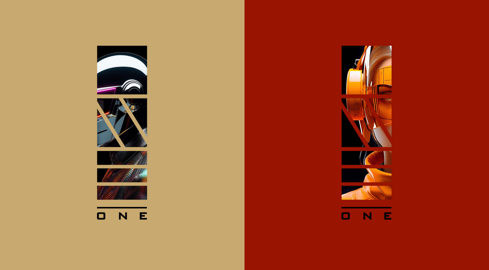
The mark is built from three shapes stacked into one form forming the word “ONE”. The logo was never intended to remain static. Its modular construction creates a frame that can hold photography, light, texture, colour and motion. On one night, it can be filled with golden reflections and a crowded dance floor. On another, it can carry lasers, performers, fashion imagery or the visual theme of a particular event.
The Visual Language
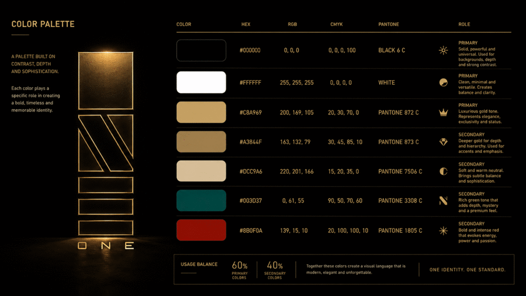
The colour palette, however, is not limited to black and gold.
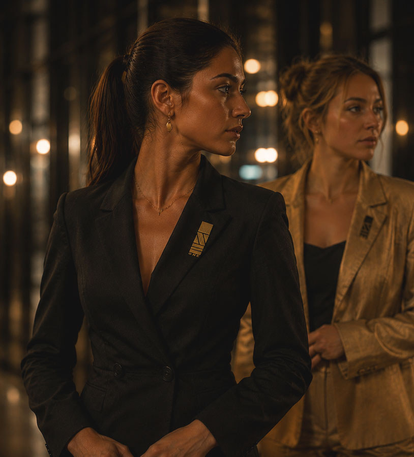
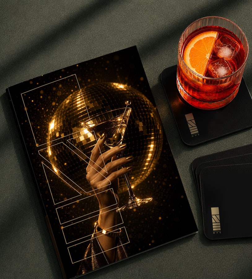
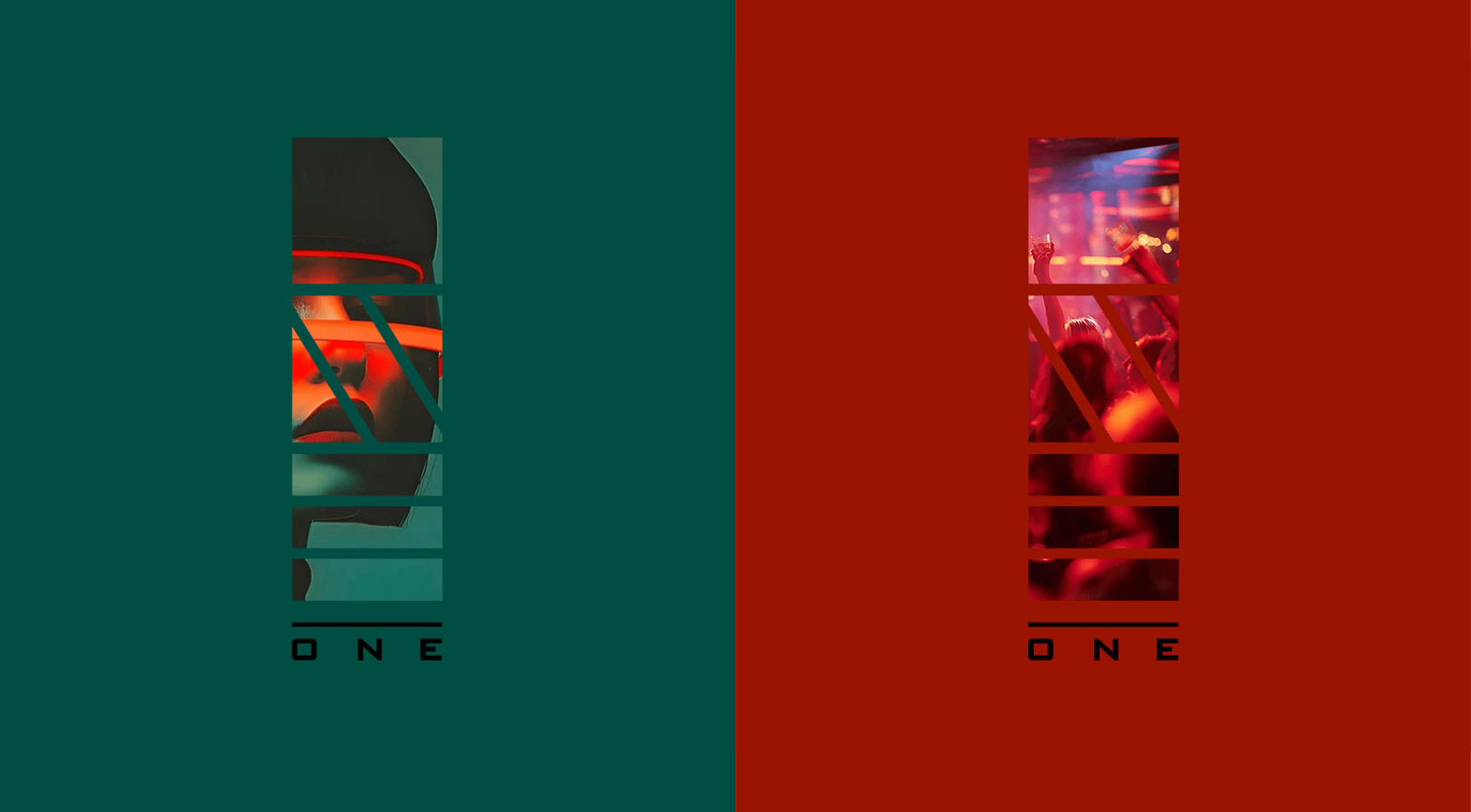
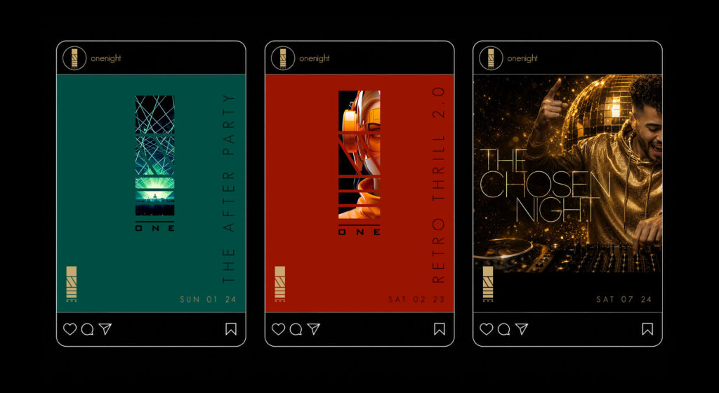
Deep green and red play an equally important role in the wider system. Green adds a richer, more unexpected atmosphere, while red brings intensity, heat and energy. These colours allow different events to establish their own mood without losing the character of ONE. Rather than depending on one fixed colour combination, the identity uses contrast as a branding tool. Black, gold, green and red can shift in prominence according to the event, image or message. The palette changes, but the logo structure keeps everything connected.
Stage and Motion
At its largest scale, the symbol becomes part of the show.
Its vertical format translates naturally onto stage screens, where it can be animated, illuminated and filled with moving imagery. Surrounded by lasers and synchronized lighting, the logo moves beyond identification and becomes part of the atmosphere itself.
Campaign & Social
Each event gets its own colorway — teal, red, gold — without ever losing the identity. The logo panel becomes a frame for whatever drives that night: a DJ silhouette, a crowd shot, 3D artwork built for the promo.
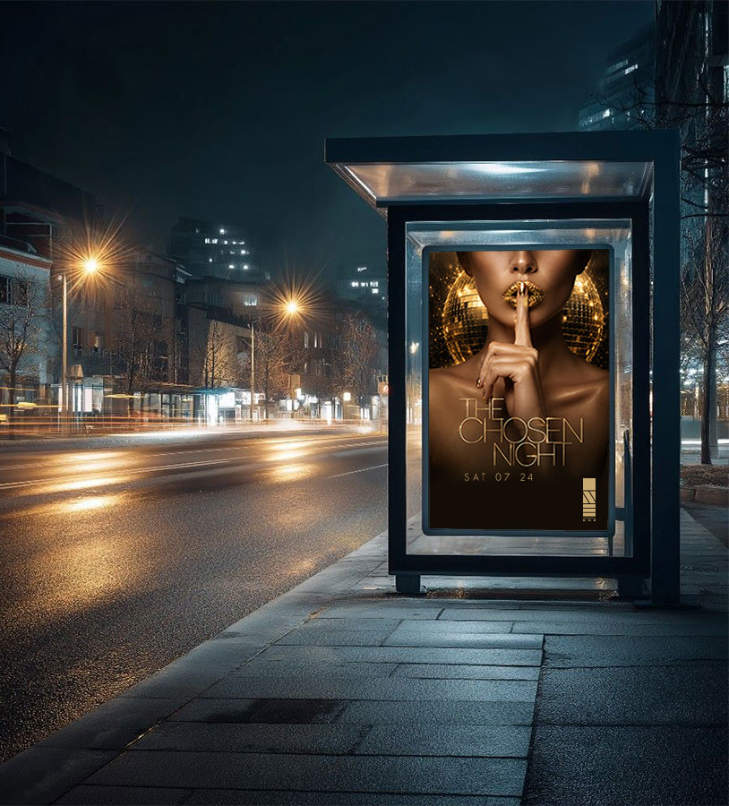
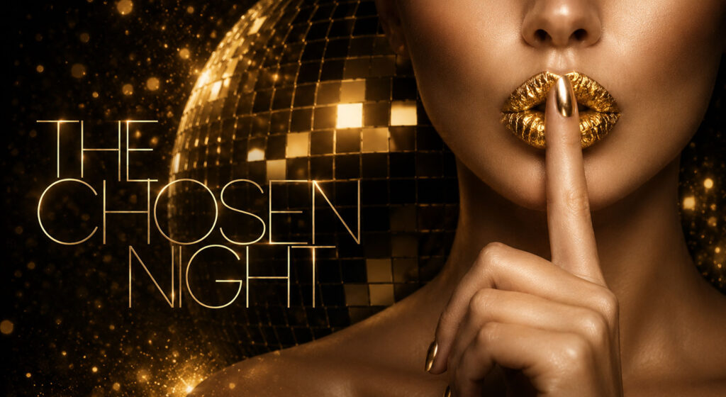
The flagship campaign, The Chosen Night, set the tone: gold lips, a raised finger, a disco ball mid-spin. At festival scale, the same mark holds up forty feet tall above a crowd, laser beams fanning out behind it.
Digital
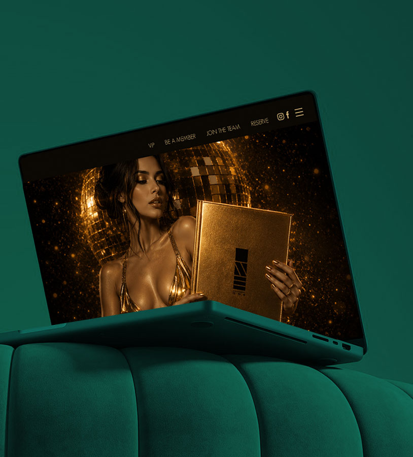
The website carries the same gold-on-black world into the browser, full-bleed photography, minimal navigation, a hero image that reads like a campaign poster.
Outcome
ONE isn’t a logo with a nightclub attached. It’s a standard applied everywhere the brand shows up, so every night reads as the same room. Different crowd. Different colorway. Different night. Walk through the door, and it all becomes one.