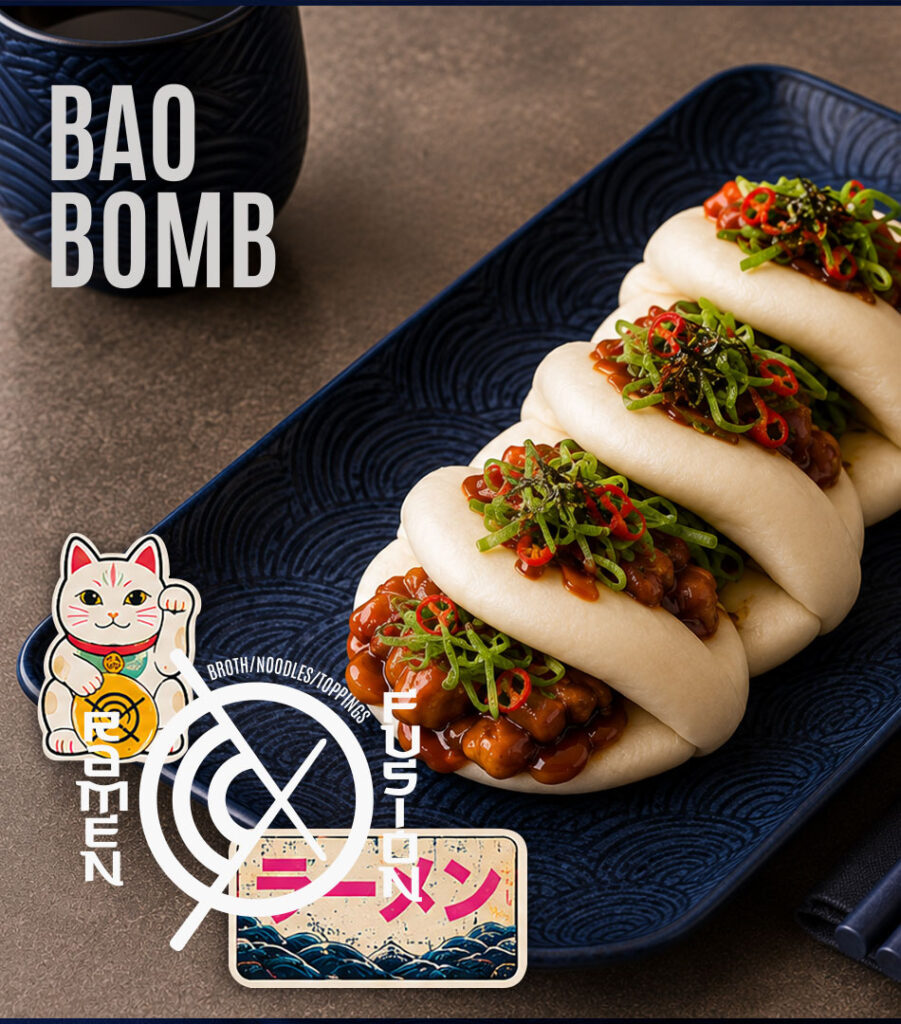
Ramen Fusion is a contemporary ramen concept built around one simple idea: taking familiar Japanese elements and presenting them in a fresh, unexpected way. The identity combines bold typography, expressive graphics and rich food photography to create a brand that feels energetic, playful and instantly recognizable.
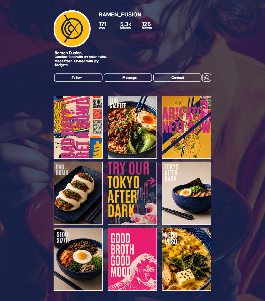
Rather than relying on traditional restaurant branding, the goal was to build a complete visual system that could live comfortably across interiors, packaging, merchandise, digital platforms and social media.
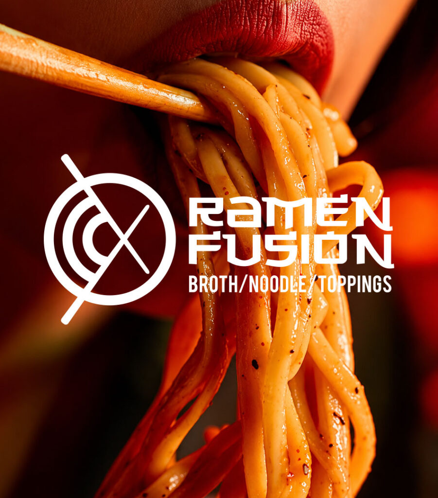
The Logo
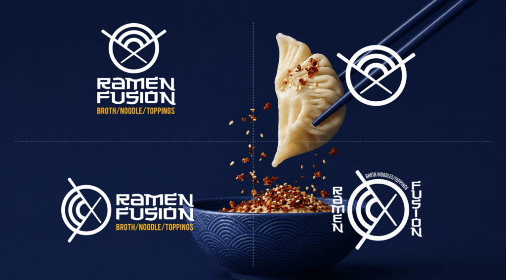
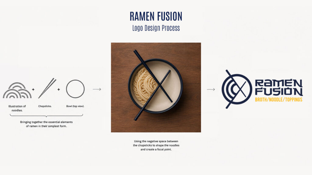
The logo started by reducing ramen to its most recognizable elements.
A bowl seen from above became the foundation of the mark, while two chopsticks crossing over it introduced movement and immediately established the context. Instead of filling the entire bowl, the negative space between the chopsticks became the focal point. That space is occupied by a simplified illustration of noodles, turning the empty area into the most memorable part of the symbol.
The result is a mark that communicates ramen without drawing a bowl of ramen. It is simple enough to work at any size while remaining distinctive enough to become the centre of the entire identity.
Building the Visual Language
The logo wasn’t treated as a standalone graphic. It became the starting point for everything else.
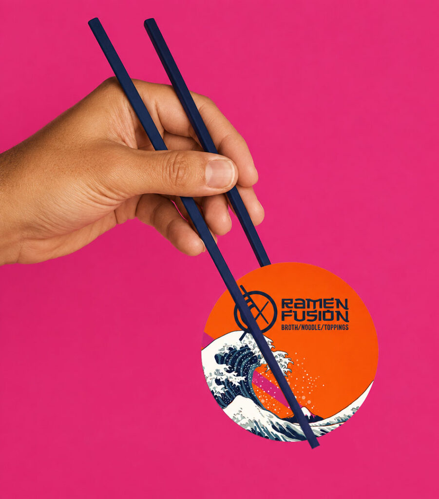
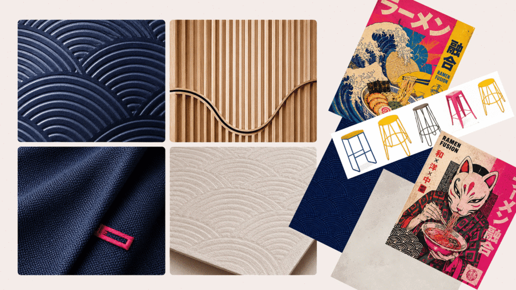
The concentric noodle illustration evolved into surface patterns and architectural textures. The diagonal chopsticks informed the compositions used throughout the menus and posters. Circular forms reappear across stickers, packaging and photography, creating consistency without repeating the logo everywhere.
Every element shares the same visual DNA.
Colour Palette
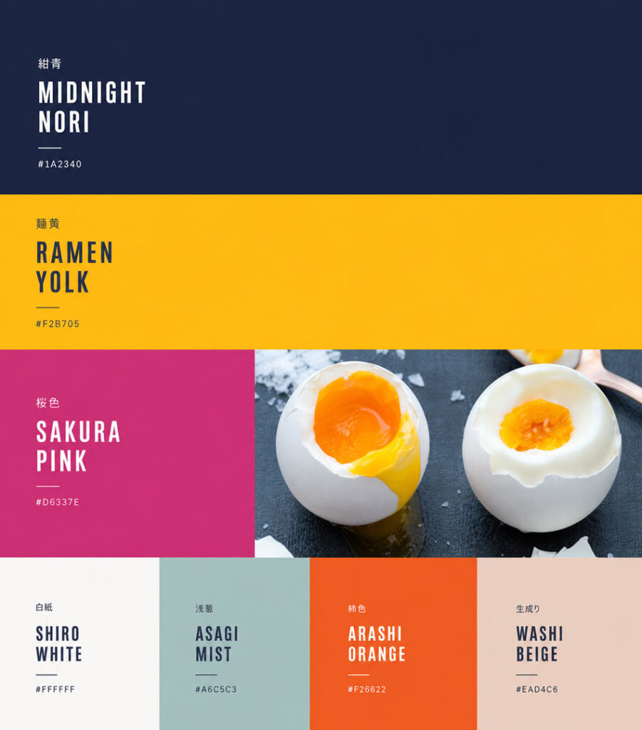
The colour palette balances warmth with contrast.
Midnight blue provides a strong foundation inspired by ceramic bowls and traditional Japanese tableware. Bright yellow brings energy and references egg yolks and rich broth, while vibrant pink introduces a contemporary, unexpected accent that gives the brand its own personality.
The remaining colours support the system without competing with the food, allowing the dishes themselves to remain the main attraction.
Typography
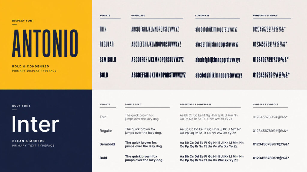
Typography became one of the strongest branding tools.
Antonio was chosen for its condensed proportions and bold presence, allowing headlines to become graphic elements rather than simply text. Inter provides contrast through clean, functional body copy, making menus and digital content easy to read.
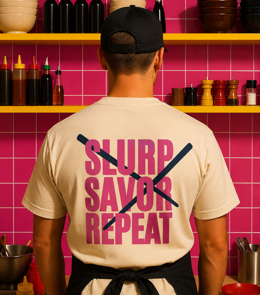
Large words such as SLURP, SAVOR and REPEAT appear throughout the brand as recurring graphic statements, adding rhythm and personality across different applications.
Interior Experience
The restaurant extends the identity beyond graphics.
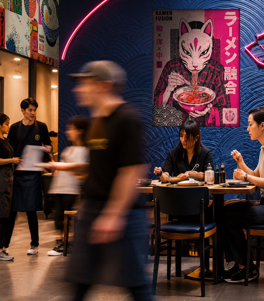
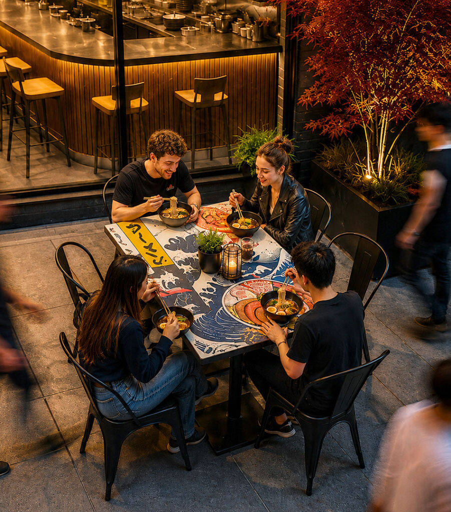
Embossed wall textures reference the noodle pattern from the logo, while large illustrated murals introduce moments of colour throughout the space. Deep navy ceramics, warm timber finishes and soft lighting create a comfortable environment that feels contemporary without losing its connection to Japanese culture.
The space was designed to feel as memorable as the food itself.
Packaging
The takeaway experience was designed to carry the same energy as the restaurant.
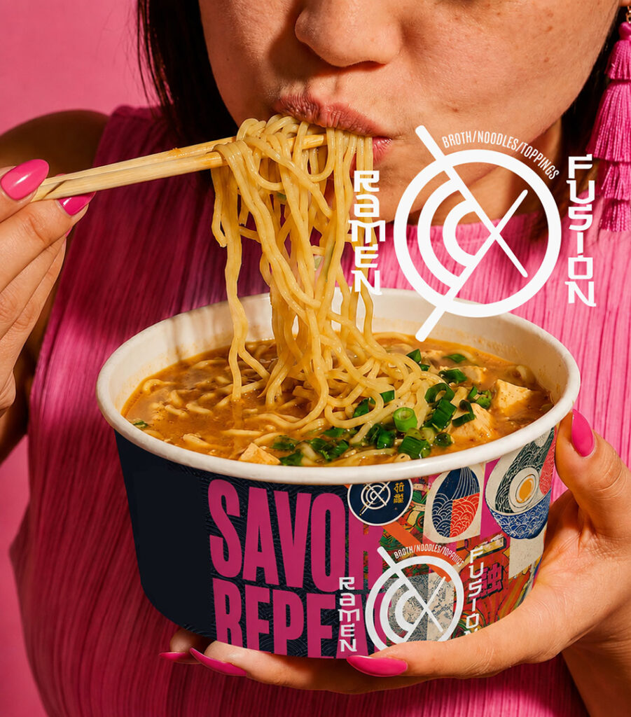
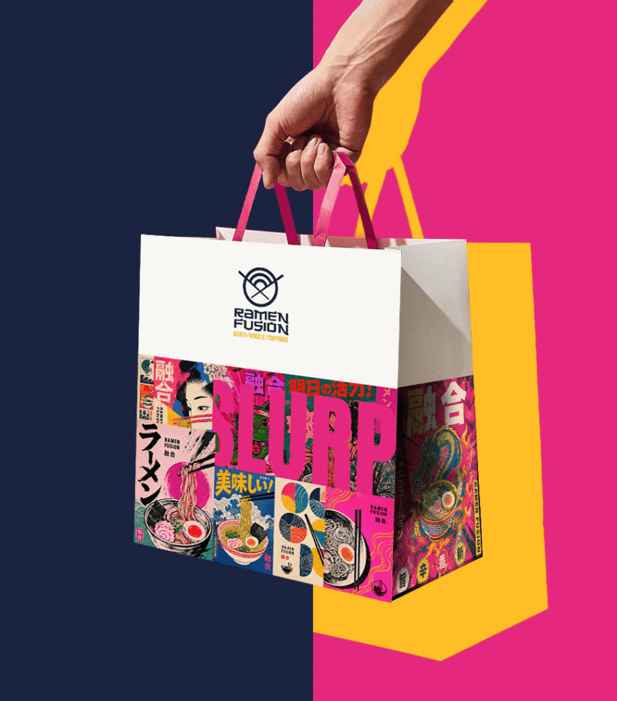
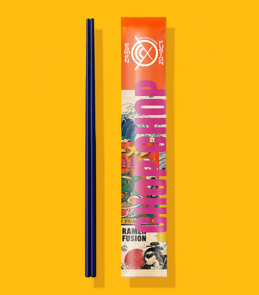
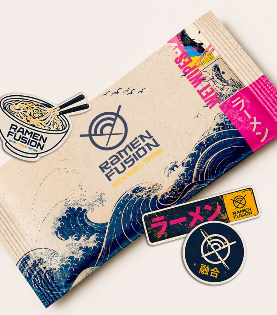
Shopping bags use oversized typography layered with Japanese-inspired artwork to make them highly recognizable. Chopstick sleeves, sauce sachets and food packaging all follow the same visual language, ensuring that even the smallest details contribute to the overall experience.
Rather than producing generic takeaway packaging, every piece becomes part of the brand.
Merchandise
The identity naturally extends into merchandise.
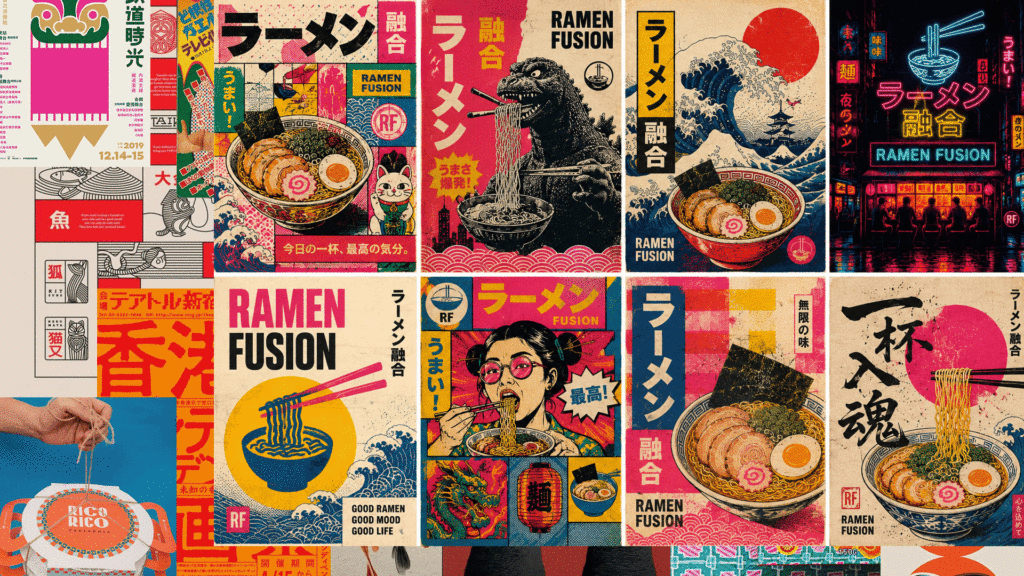
Staff uniforms, stickers and branded accessories were designed with the same bold graphic language used throughout the project. Instead of promotional items, they feel like products people would actually want to own.
The sticker collection in particular introduces a playful side to the brand, mixing Japanese references, typography and illustrations into collectible pieces that reinforce the personality of Ramen Fusion.
Digital Presence
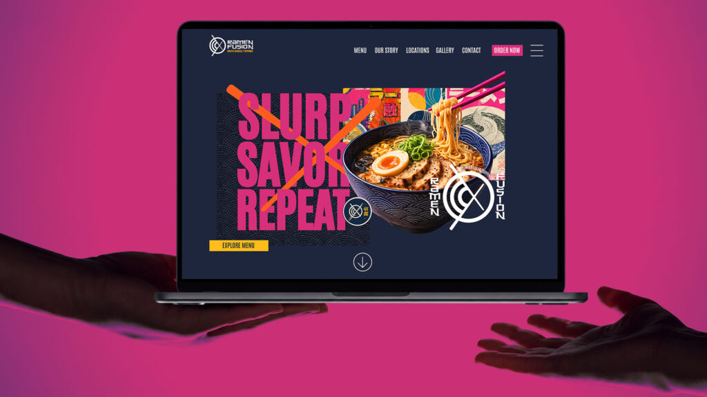
The website continues the same visual language found throughout the physical experience.
Large typography, layered graphics and bold food photography create a homepage that immediately communicates the personality of the restaurant. Motion and composition keep the experience dynamic while maintaining a clear hierarchy for navigation and ordering.
Rather than reproducing the restaurant online, the website expands the brand into a digital environment.
Photography
Food photography focuses on texture, movement and atmosphere.
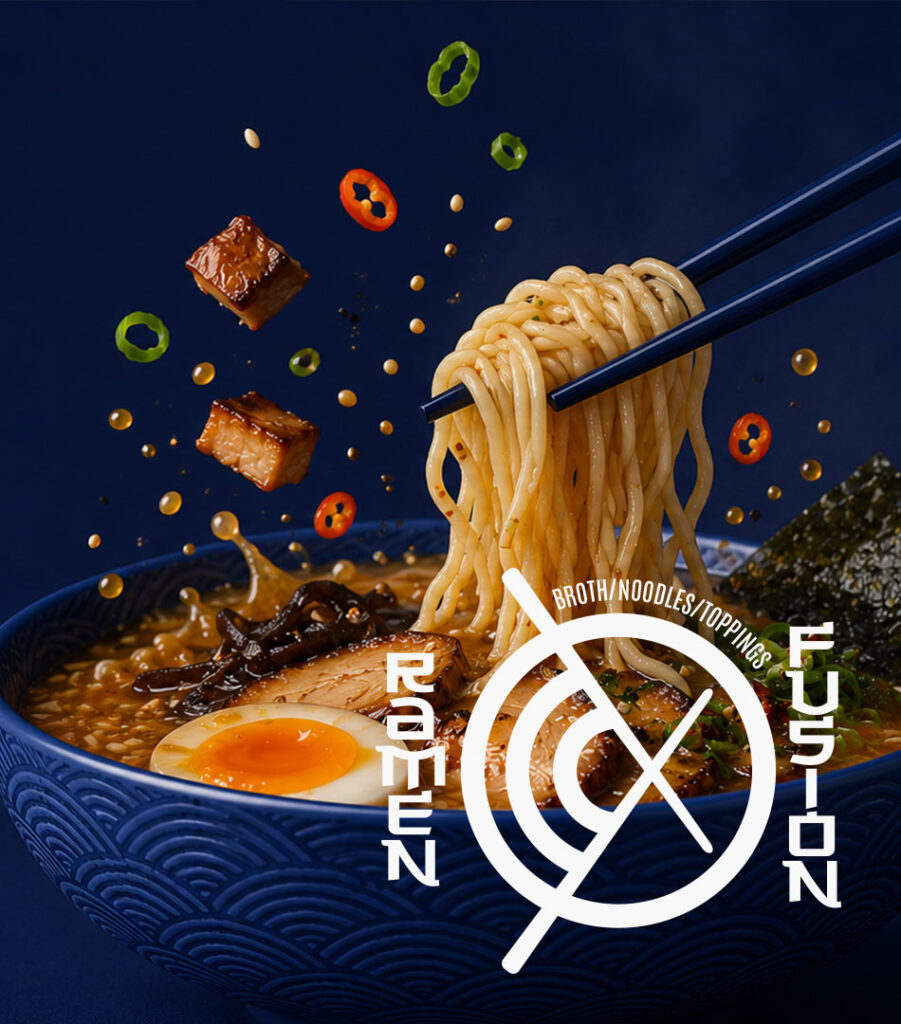
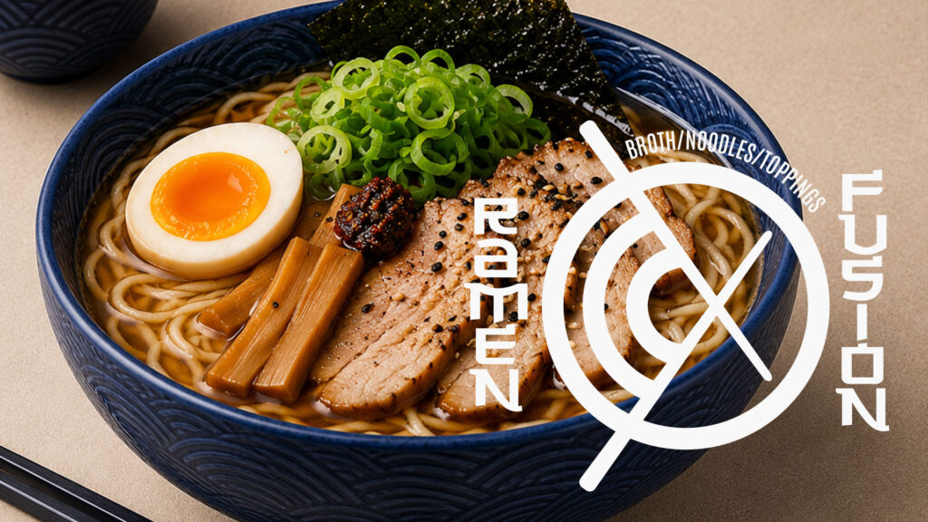
Close-up shots highlight steam, noodles and broth, while wider lifestyle imagery captures the social experience of sharing a meal. Consistent use of the navy bowls and colour palette ties every image back to the identity, making the photography feel like part of the branding rather than separate marketing content.