
Empire Pizza is a Texas-based pizza concept bringing together Italian roots, New York attitude and a fast, contemporary dining experience. The identity needed to communicate that combination immediately. It had to feel authentic enough for people who take pizza seriously, but relaxed enough not to take itself too seriously.
The result is a bold visual system built around New York references, oversized typography, a limited red, black and white palette, and a brand voice with a healthy appetite for bad pizza jokes. Because sometimes carbs really are just hugs.
The Logo
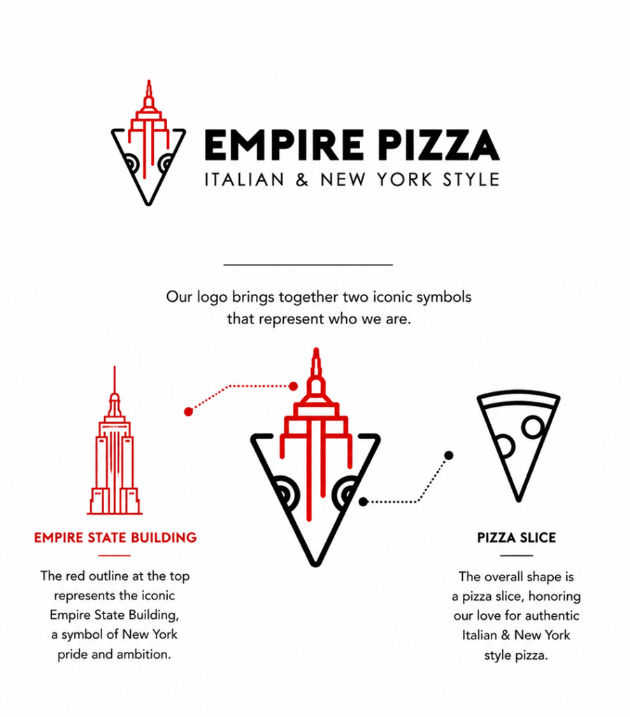
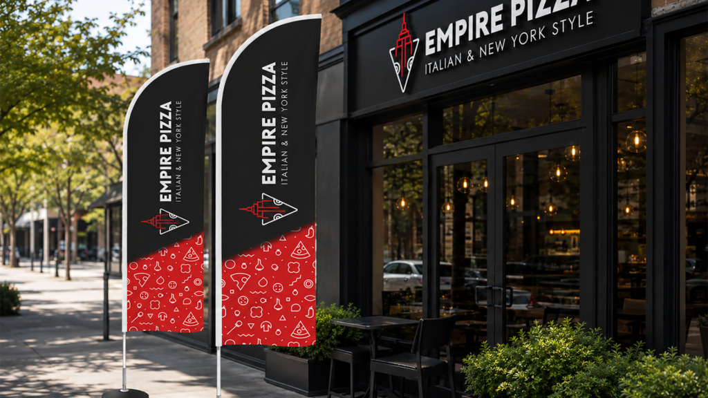
The logo brings together two instantly recognizable symbols: a pizza slice and the Empire State Building. Together, the two forms tell the brand story in one symbol: New York represented through pizza.
The mark is paired with a bold, straightforward wordmark and the descriptor “Italian & New York Style.” The typography keeps the identity confident and easy to recognize, whether it appears above a storefront, on a pizza box or in the corner of a mobile screen.

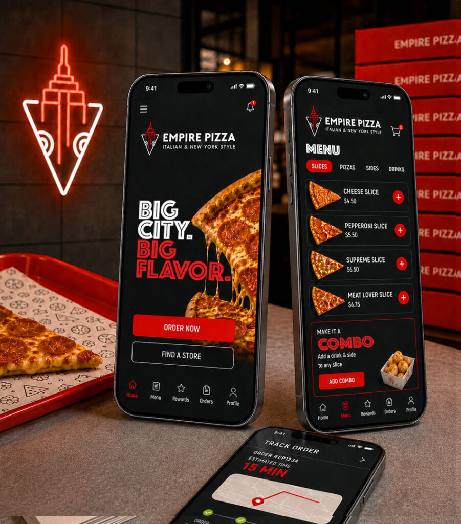
Big City. Big Flavor.
New York became more than a reference inside the logo. It shaped the attitude of the entire identity. The brand speaks with the confidence, speed and directness associated with the city. Headlines are large, compact and difficult to ignore. Messages get to the point quickly because nobody wants to read an essay while their pizza gets cold. “BIG CITY. BIG FLAVOR.”, The line captures the promise simply: generous portions, strong flavor and no unnecessary complications.
The Visual Language
Red, black and white form the core of the identity.
Red brings appetite, energy and visibility. Black adds contrast and gives the brand a stronger urban edge, while white keeps the system clean and direct. Together, the colours create a look that works equally well across packaging, interiors, uniforms, menus and digital ordering.
The compositions are deliberately bold. Typography is often oversized, cropped or layered over food photography… Closer to the personality of a busy New York pizza shop than a formal Italian restaurant.

A Pattern with Everything
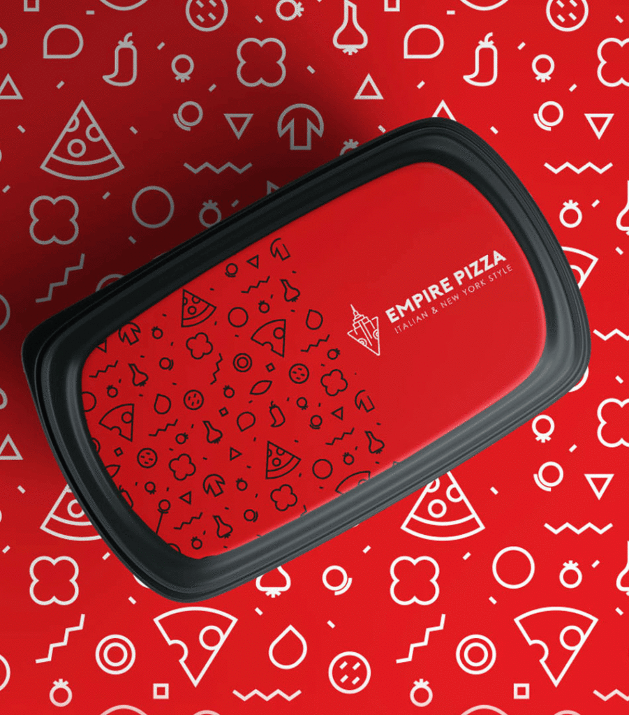
The supporting pattern turns familiar pizza ingredients into a collection of simple line icons.
Slices, mushrooms, onions, peppers, tomatoes and other toppings are mixed with geometric shapes to create something playful and flexible. It brings more detail to packaging without competing with the logo, and gives even the most functional items a recognizable Empire Pizza character.
The pattern can fill an entire surface or appear as a smaller accent. On boxes, containers and interior graphics, it helps the brand stay consistent without making every item look identical.
Much like pizza, the same ingredients can produce plenty of variations.
Packaging
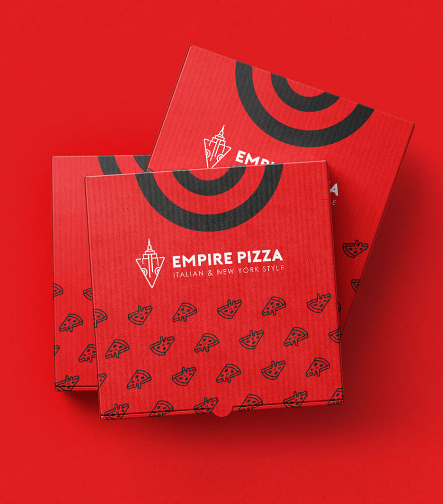
The takeaway experience is a major part of the brand.
Full pizza boxes use bold areas of red, repeated slice illustrations and circular graphics inspired by targets, plates and the shape of a pizza itself. Individual slice boxes turn their triangular construction into part of the idea, pairing playful illustrations with lines such as “Slice to Meet You.”
Salad containers, drinks and other takeaway items follow the same system, allowing every order to feel connected regardless of what is inside it.
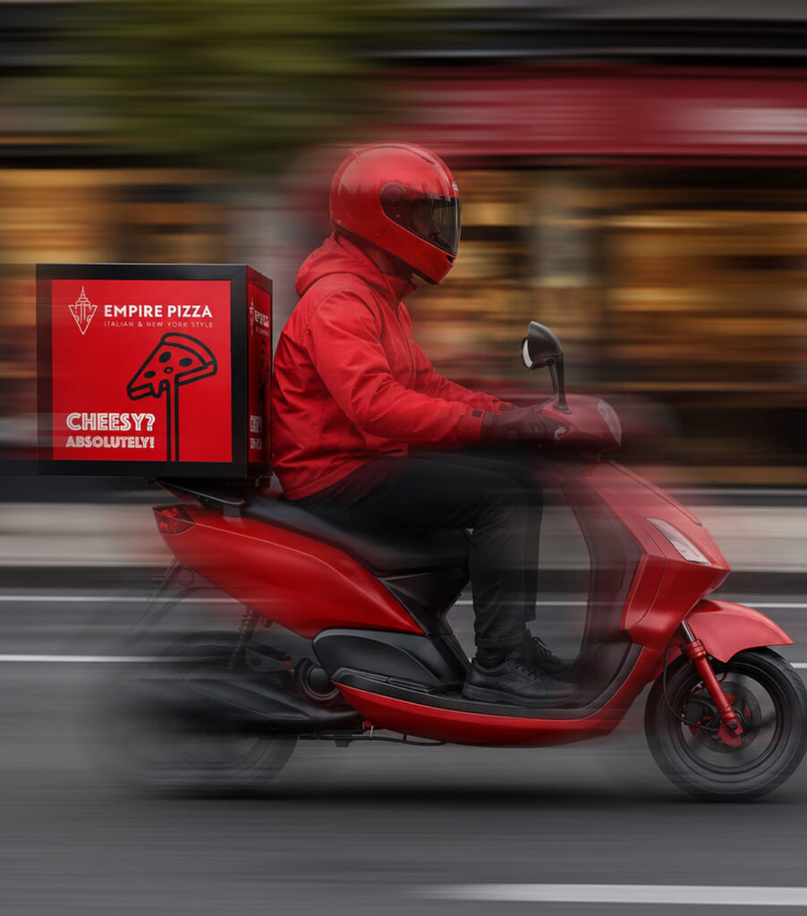
The packaging is practical, recognizable and designed to be noticed on a table, in someone’s hands or moving through the city on a delivery scooter.

A Brand with Crust Issues
Empire Pizza’s voice gives the identity much of its personality.
Instead of relying on generic claims about freshness and quality, the brand uses short, playful statements built around pizza, cravings and the occasional questionable life decision.
IN CRUST WE TRUST.
CARBS ARE JUST HUGS.
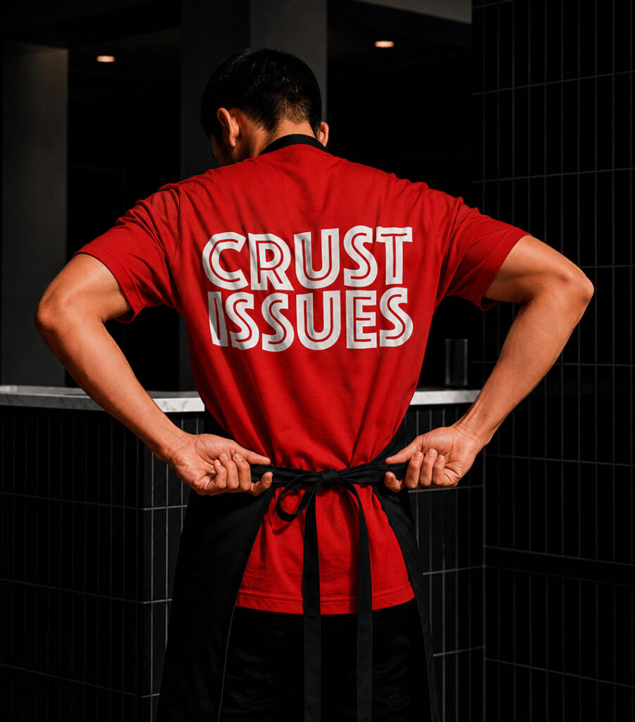
CRUST ISSUES.
CHEESY? ABSOLUTELY.
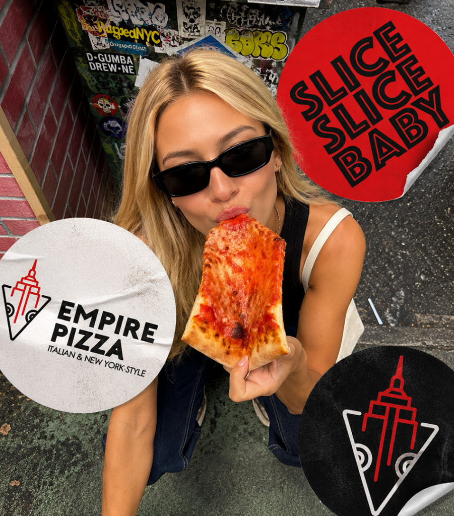
SLICE, SLICE, BABY.
The humour is intentionally simple. It makes the brand feel approachable and gives people something they might actually want to wear, photograph or share.
The staff uniforms are a good example. Rather than treating them as standard workwear, the shirts become part of the communication. The person serving the pizza carries the brand voice with them… sometimes literally on their back.
The Interior
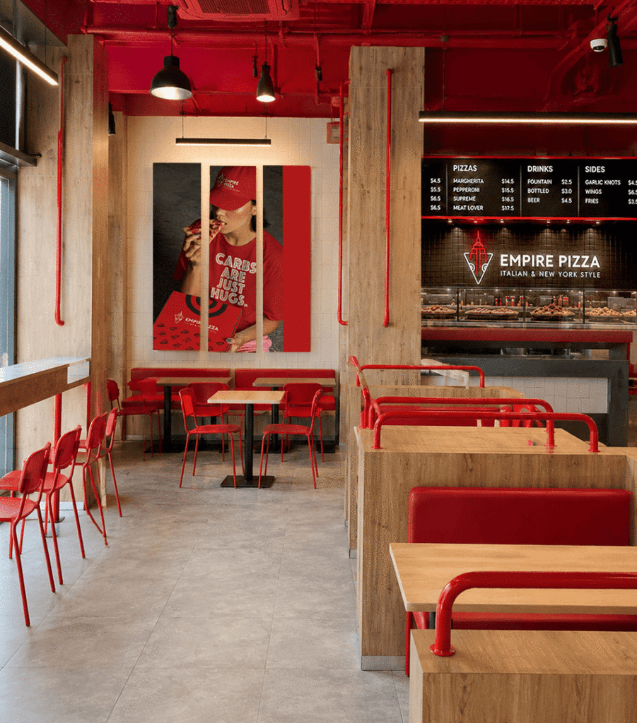
The restaurant brings together the directness of a New York pizza shop with a cleaner, more contemporary setting.
Red metal details, black tiles, warm timber and simple industrial lighting create a space that feels casual but considered. Large wall statements become part of the architecture, while packaging shelves, menu boards and illuminated signage keep the visual identity present throughout the experience.
The interior is not filled with themed New York decorations. The connection comes through more naturally… in the typography, materials, energy and pace of the space.
The Brand
Empire Pizza is built around a clear combination: New York confidence and a casual Texas dining experience.
The logo establishes the story.
The colour makes it visible.
The typography gives it attitude.
And the language makes it human.
The result is a brand that feels bold, approachable and difficult to confuse with anyone else.
Good pizza. Big flavor. No compromises.