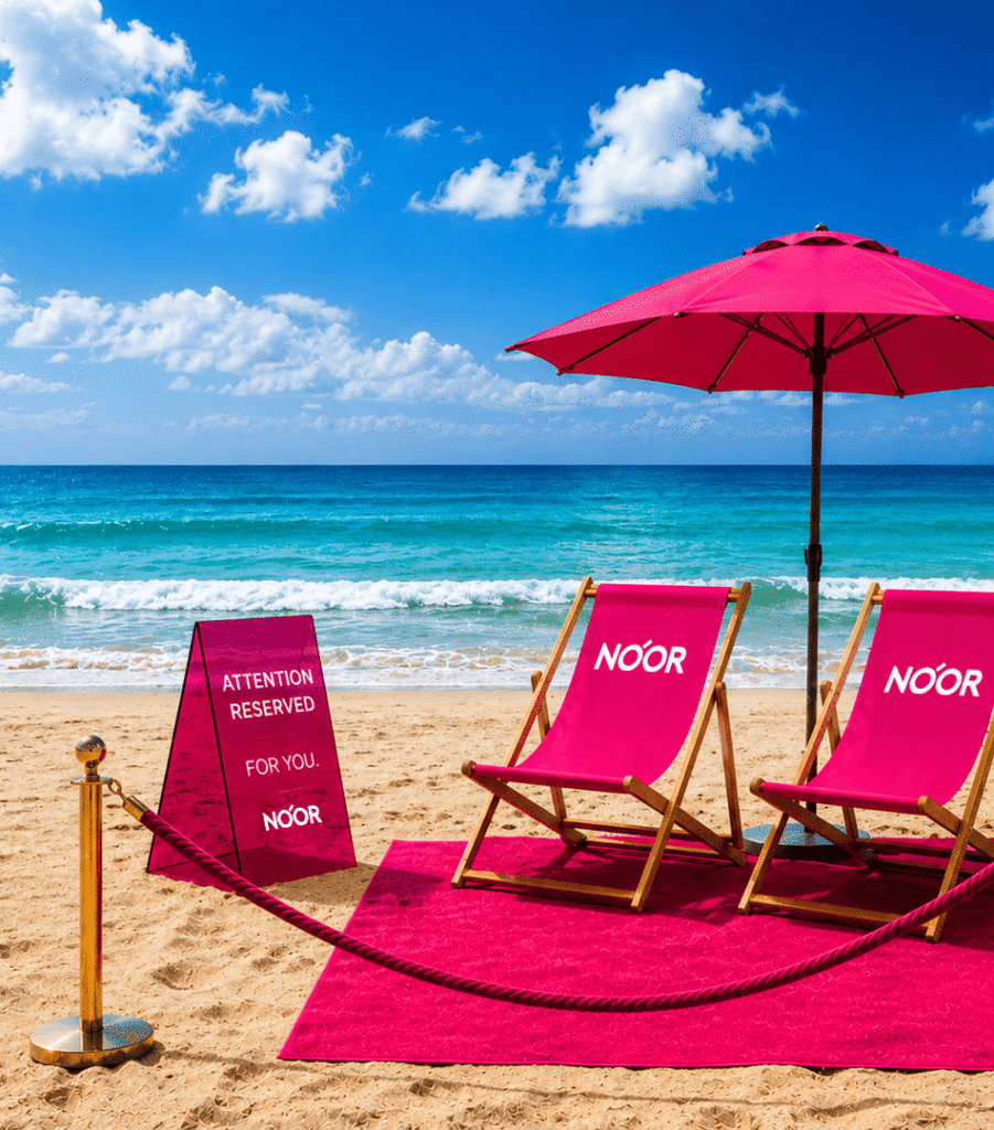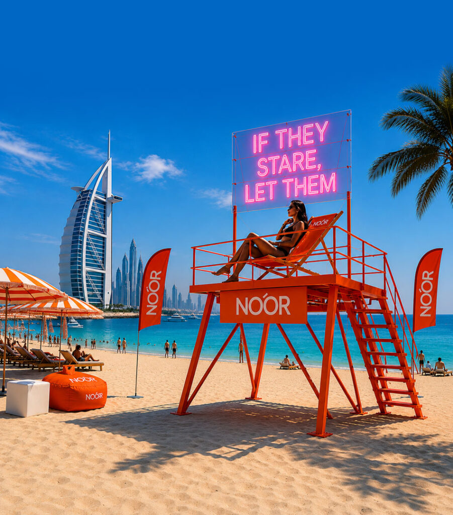
Inspired by Light. Designed to Be Seen.
NOÓR takes its name from the Arabic word for light. But rather than treating light as a technical feature, the brand interprets it as a cultural and emotional force.
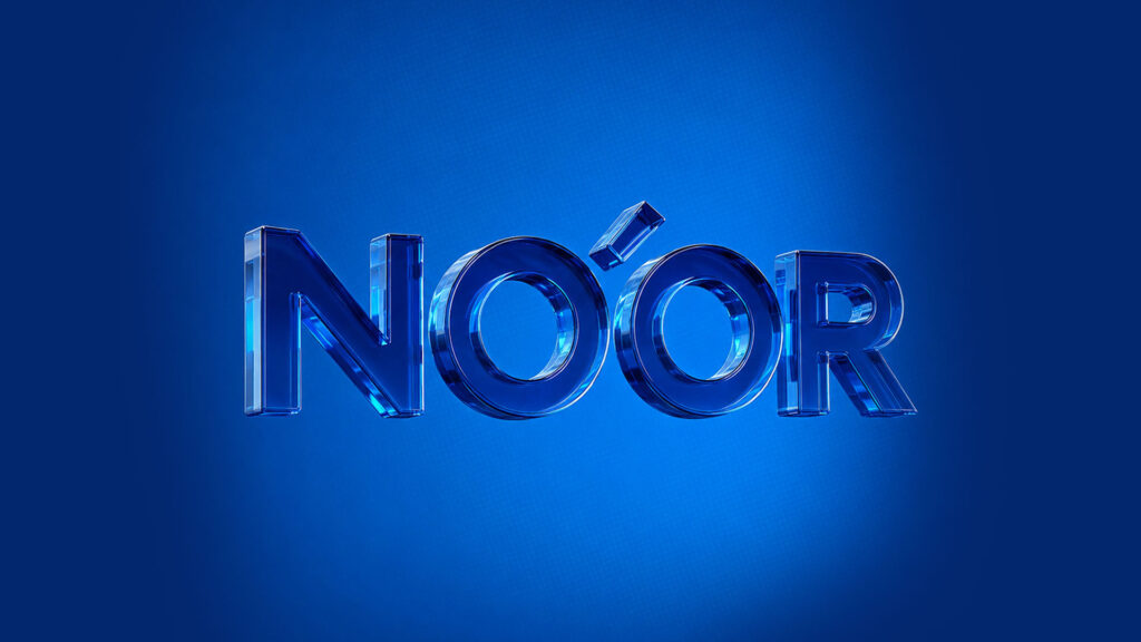
That idea became the foundation of the brand.
NOÓR was created for people who don’t see sunglasses as a necessity, but as an extension of their personality. The product protects your eyes, of course, but more importantly, it becomes part of how you present yourself to the world.
The brand is not designed to blend in.
It is designed to be noticed.
The Logo
The NOÓR wordmark is deliberately bold and uncomplicated. It doesn’t rely on decorative details or trends. Instead, it uses strong geometric forms that feel confident, modern, and instantly recognizable.
At the heart of the logo sits the accent above the Ó.
What started as a typographic detail quickly became the most distinctive element of the identity. Rather than treating it as punctuation, we transformed it into a visual signature for the entire brand.
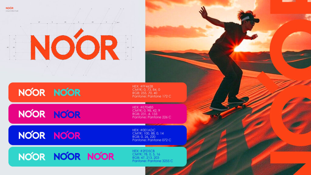
It can be read in many ways.
A ray of sunlight.
A reflection hitting a lens.
A spark.
A highlight.
A moment that catches your attention.
Like the brand itself, it is a small detail that refuses to go unnoticed.
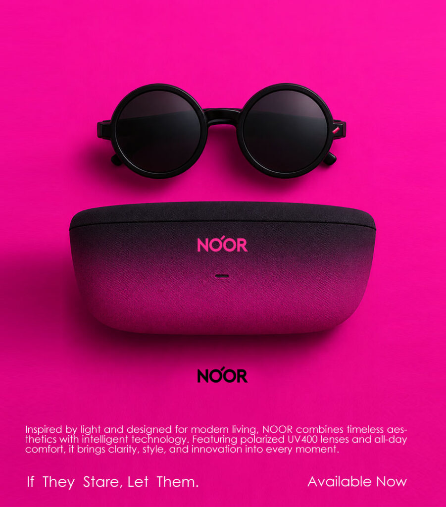
A Signature Beyond the Logo
The diagonal accent doesn’t stay confined to the wordmark.
It becomes a physical feature of the product itself, appearing on every frame as a recognizable brand signature.
This creates a direct connection between identity and product. Even without seeing the logo, you can recognize a pair of NOÓR sunglasses by that single gesture.
Simple. Distinctive. Memorable.
The best brand assets often work this way. They become part of the product rather than something applied onto it.
The Visual Language
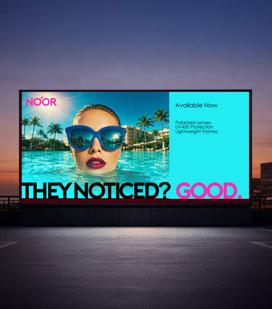
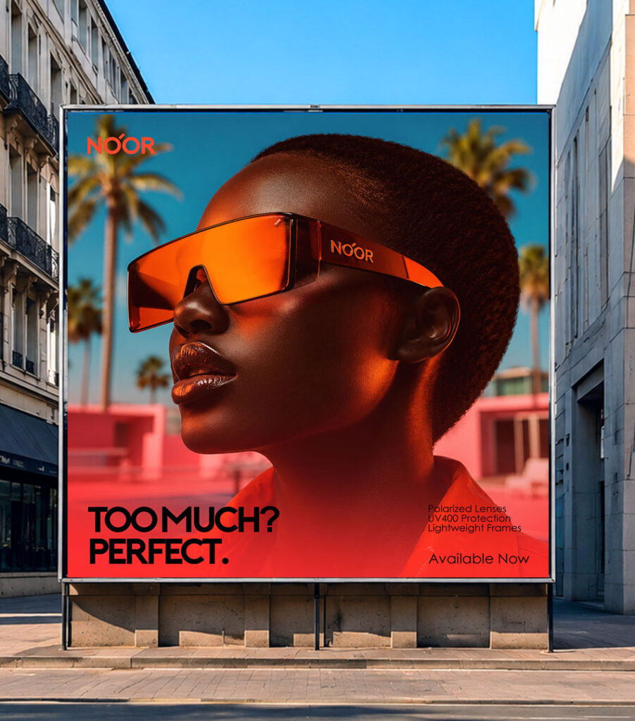
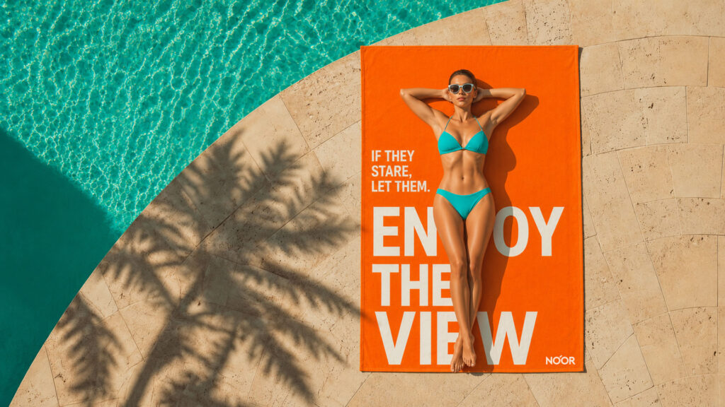
Everything about the NOÓR visual world is inspired by places where light is at its strongest.
Beaches. Palm-lined streets. Poolside afternoons. Neon reflections. Tropical colors. Endless summers.
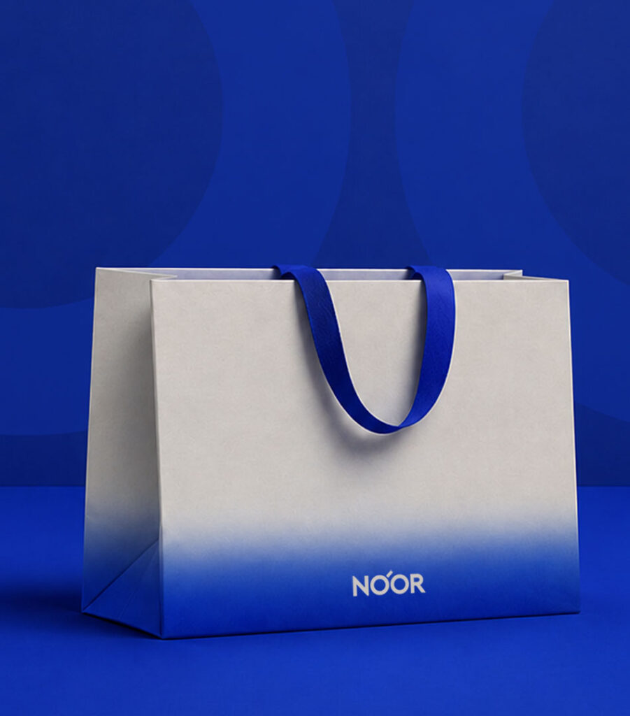
The palette embraces vibrant, high-energy tones that feel sun-drenched and unapologetically bold. Electric pinks, intense blues, vivid oranges, reflective surfaces, and deep contrasts create a world that feels optimistic, playful, and impossible to overlook.
Nothing about the brand is designed to fade into the background.
The Attitude
Most eyewear brands talk about craftsmanship, protection, or performance.
NOÓR talks about confidence.
The brand is built around a simple observation:
People don’t wear great sunglasses because they want to disappear.
They wear them because they want to feel good, stand out, and express themselves.
That thinking became the foundation for the communication platform.
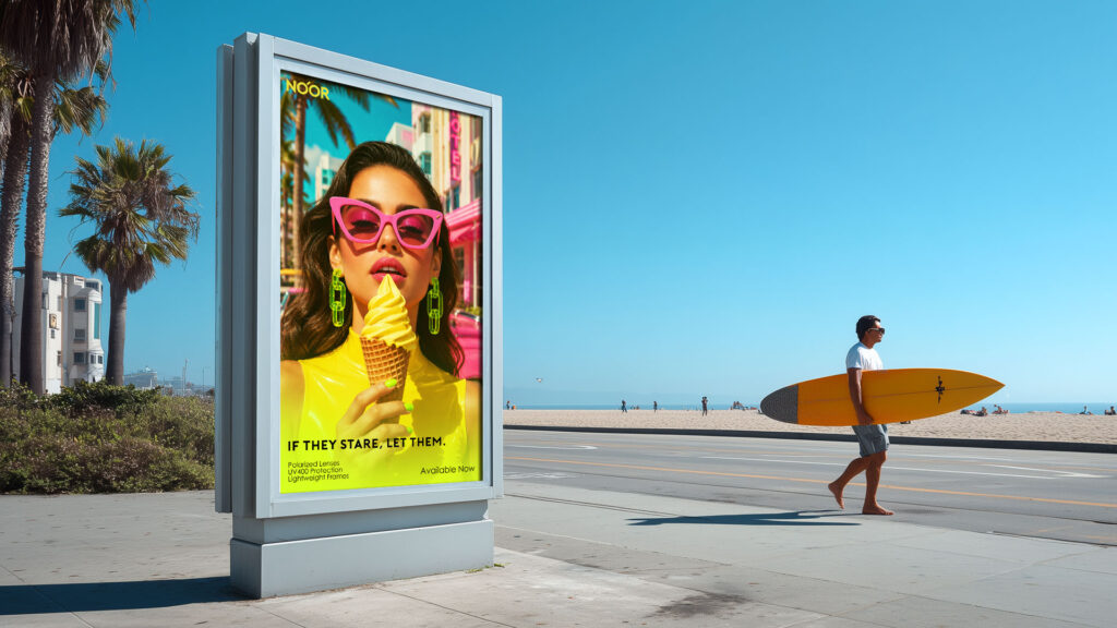
IF THEY STARE, LET THEM.
It isn’t an invitation to seek attention.
It’s permission to stop apologizing for it.
The line celebrates individuality, confidence, and self-expression. It speaks to people who are comfortable taking up space, wearing bold colors, and embracing who they are without worrying about outside opinions.
From that same attitude comes a family of messages:
TOO MUCH? PERFECT.
THEY NOTICED? GOOD.
LOOKING IS FREE.
Every line carries the same spirit: playful, confident, and just the right amount of provocative.
The Brand
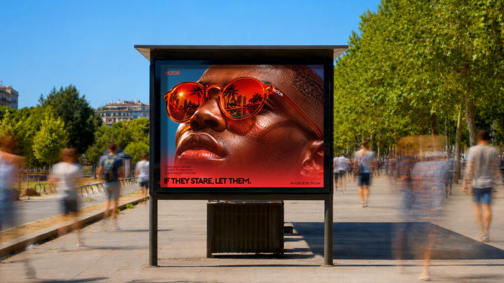
At its core, NOÓR is a celebration of visibility.
Of light.
Of confidence.
Of standing out rather than fitting in.
It is a brand for people who enjoy being seen, who understand that style is a form of self-expression, and who know that sometimes the best response to attention is simply to enjoy it.
After all, if they stare, let them.