
Argenta is a Romanian industrial engineering and construction company founded in 1993. Based in Năvodari, the company specializes in the prefabrication and installation of pipelines, industrial equipment, steel structures and storage tanks. Over more than three decades, it has grown to a team of over 250 people and delivered more than 1,000 projects across the oil and gas, chemical, energy, infrastructure and industrial sectors.
The company had evolved considerably since its original identity was created. The challenge was to give the brand the same sense of progress, making it feel sharper, more technical and better suited to the scale of the work Argenta delivers today.
This was not about walking away from its history.
It was about building on it.
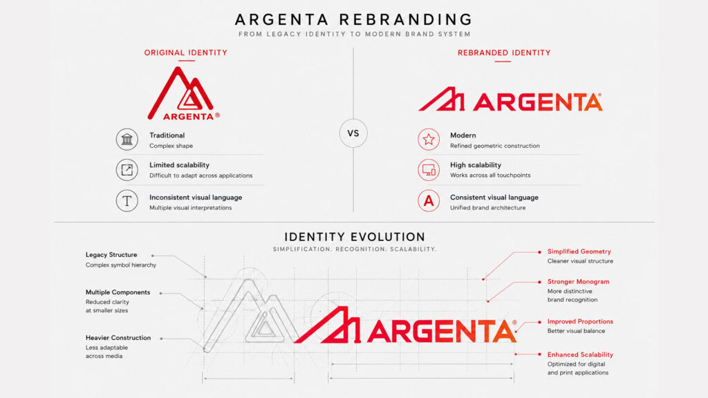
Evolving the Logo
The original logo had recognition, but its complex construction made it difficult to reproduce consistently. The symbol contained several competing shapes, while its weight and proportions limited how effectively it could work at smaller sizes and across digital applications.
We kept its most familiar idea and rebuilt it.
The mountain-like structure was simplified into a cleaner geometric monogram. Inside it, the negative space forms an A, while the vertical element introduces the number 1—a detail that gives the symbol a stronger and more distinctive character.
The new version is wider, more balanced and easier to recognize. Its forward-moving angles suggest construction, elevation and progress without relying on literal industrial imagery.
The identity changed, but Argenta remained visible within it.
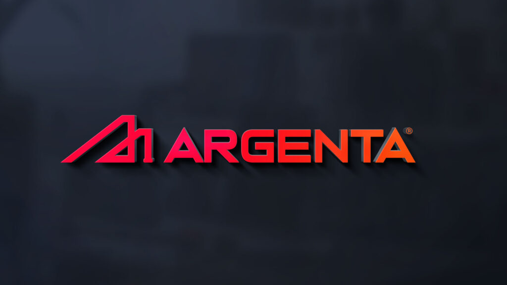
The Wordmark
The wordmark was redrawn to match the new symbol.
Wide letterforms give the name a stable, industrial presence, while the angled cuts connect the typography to the geometry of the monogram. The result feels engineered rather than decorated, precise enough for a technical company, but distinctive enough to carry a brand.
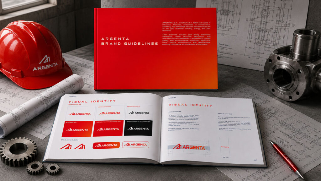
Symbol and name now work as one unit, with proportions designed to remain clear across everything from large building signage to a helmet, identification card or mobile screen.
The Colour System
Red remains at the centre of the identity.
It is direct, energetic and highly visible in industrial environments. A shift from red into orange gives the palette more depth and reflects heat, energy and movement. Deep navy provides the technical foundation, while white keeps information clear and functional.
Together, the colours create a system that feels bold without becoming aggressive. They also perform a practical role: maintaining visibility across uniforms, safety equipment, vehicles, outdoor signage and digital interfaces.
A Pattern Built from the Work
The visual language takes inspiration from the forms found throughout Argenta’s projects.
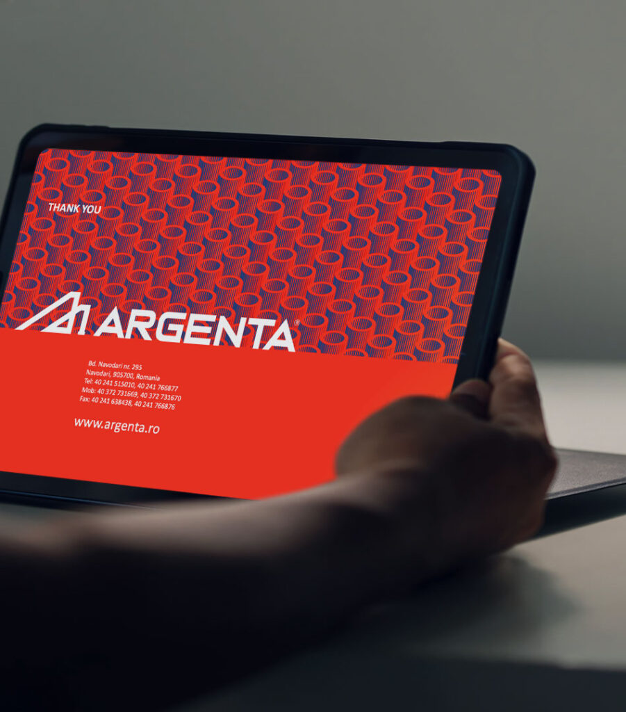
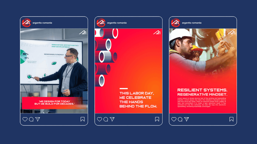
Repeated cylindrical shapes reference pipes, tanks and fabricated industrial components. Arranged as a pattern, they introduce rhythm and movement while giving the brand an additional asset beyond the logo.
The pattern can sit quietly in a presentation or become much more expressive across a digital screen. It adds personality to a technical identity without losing its connection to what the company actually builds.
The Industrial Environment
Argenta works in spaces where clarity matters.
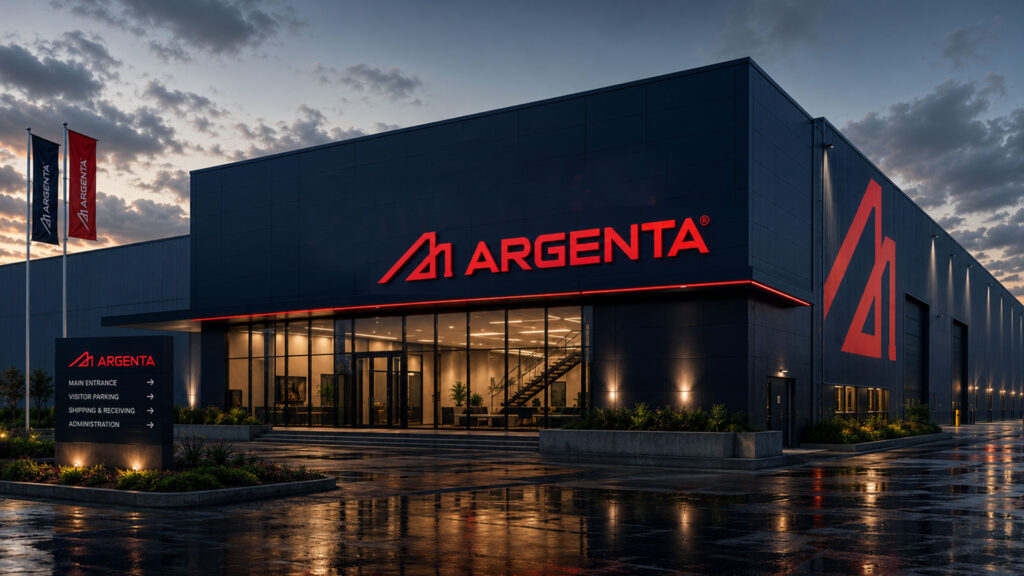
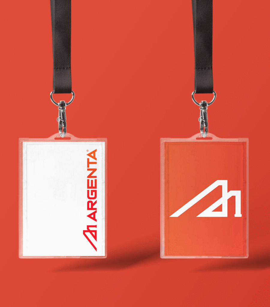
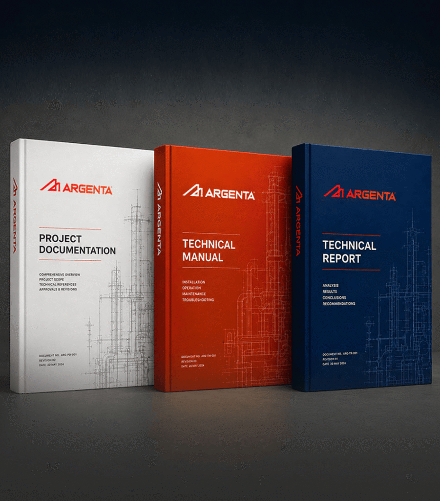
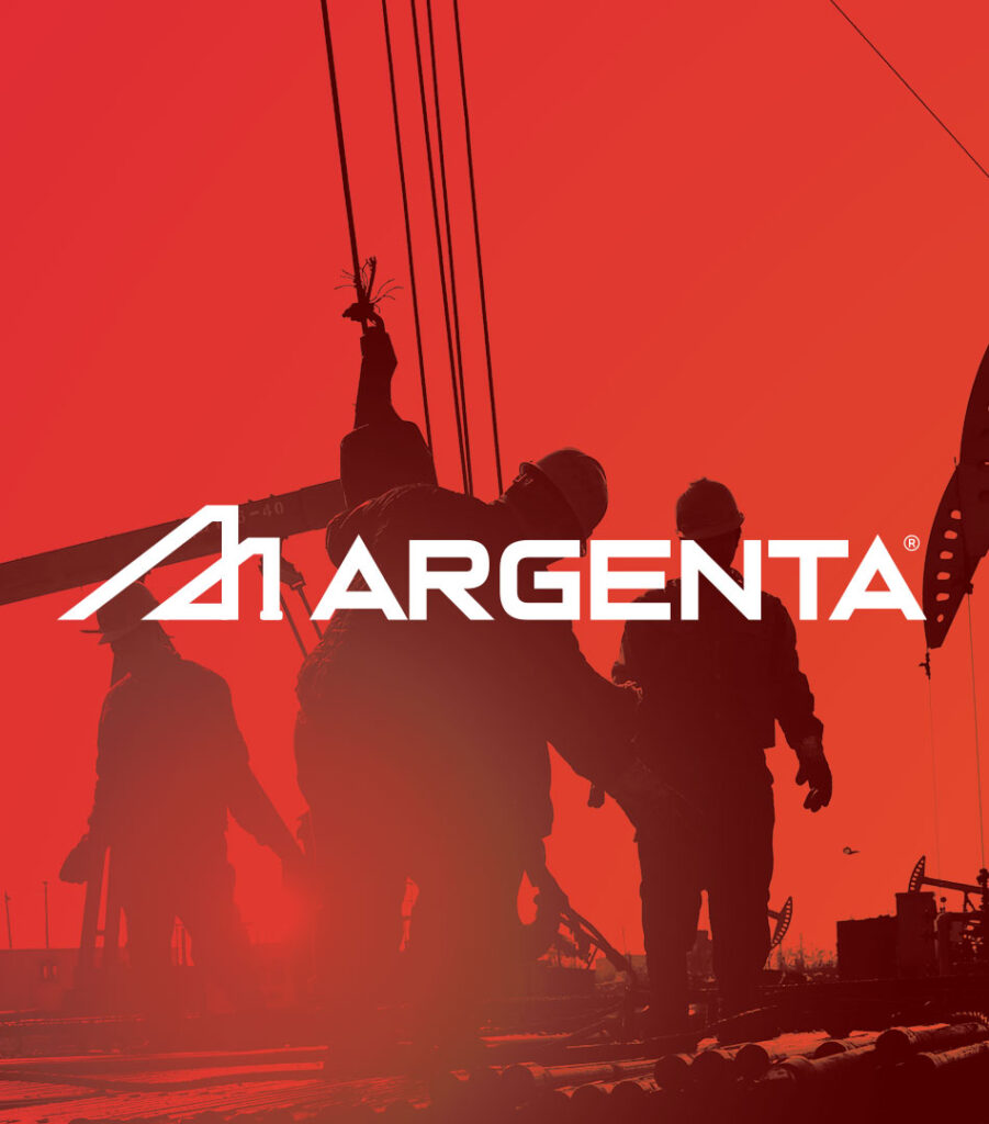
The identity was therefore designed to function at very different scales, from factory façades and directional signage to helmets, staff badges and technical documents. The simplified monogram can be recognized from a distance, while its clean construction remains legible when reduced.
Across facilities and worksites, the brand feels like part of the environment rather than something placed on top of it.
Strong. Practical. Easy to recognize.
Digital Experience
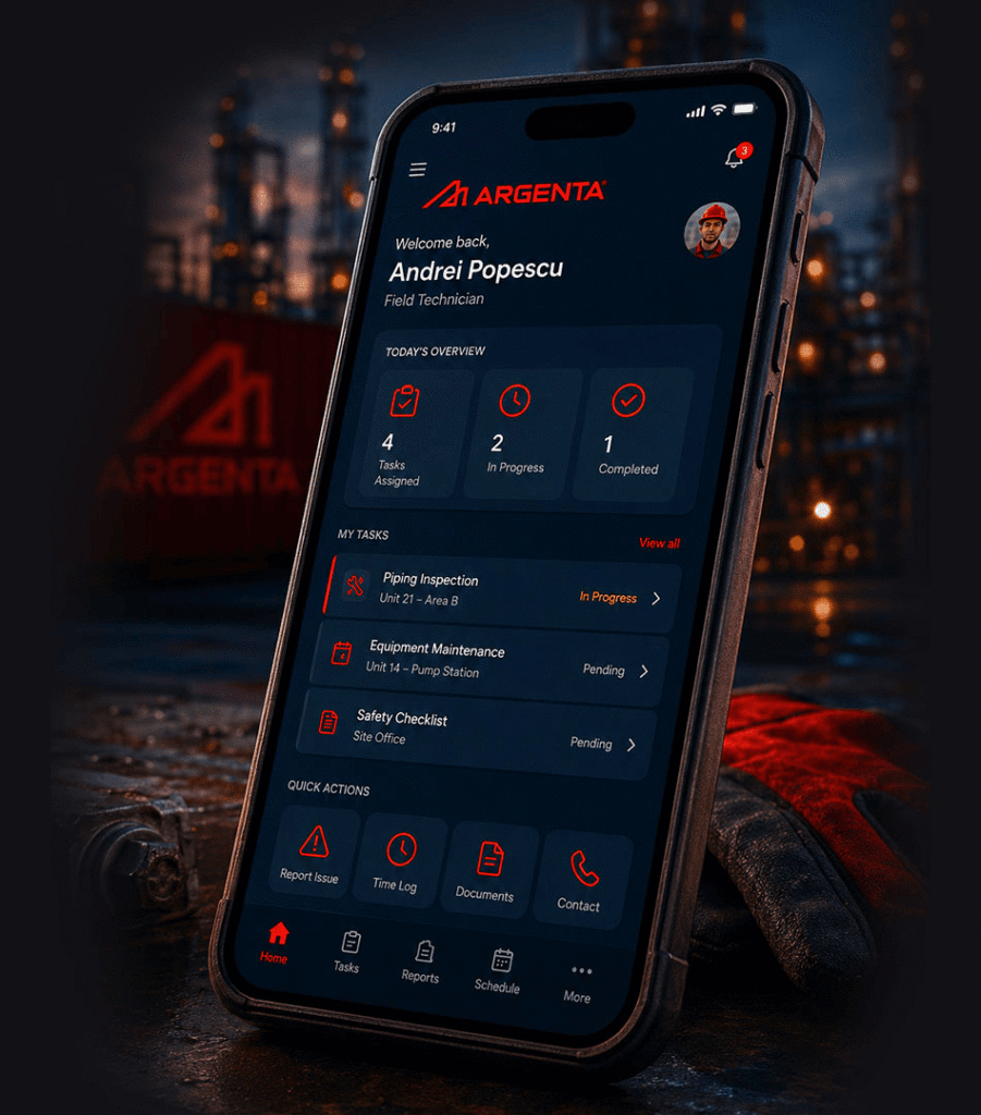
The digital identity brings the same structure into a clearer, more contemporary interface.
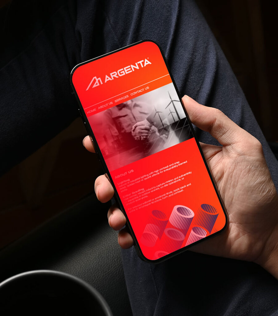
Deep navy backgrounds establish a technical and professional tone, while red is used to guide attention toward important information and actions. Angled image crops echo the geometry of the logo and help organize complex content without making the pages feel heavy.
The website presents Argenta’s services, projects, sectors and technical capabilities in a way that is easier to navigate, while the employee application translates the identity into a practical operational tool.
The system is not only designed to explain the company.
It is designed to work for it.
Communication and Recruitment
A company of this scale also needs to communicate with more than clients.
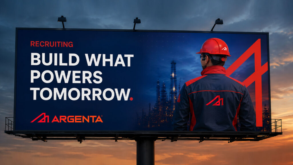
Recruitment campaigns use direct statements, large typography and real industrial settings to speak to the people behind the work. The message “Build What Powers Tomorrow” connects individual roles to the larger impact of the company’s projects.
The tone is confident but grounded. It celebrates engineering and skilled work without turning them into something abstract.
Argenta’s values, precision, safety, quality and collaboration are reflected not only in the language, but in the way the entire identity is constructed.
The Brand
Argenta’s new identity respects what the company had already built while preparing it for what comes next.
The logo is simpler.
The system is stronger.
The applications are more consistent.
And the brand now matches the scale and precision of the work behind it.
Built on experience. Driven by innovation.