
Maison S is a bakery and patisserie in Beirut created around the pleasure of freshly baked bread, delicate pastries and small moments that can improve an entire day.
The identity needed to feel refined, but never distant. It had to reflect the care and precision associated with French pastry while retaining the warmth, generosity and familiarity of a neighbourhood bakery.
The result is a brand that treats every product as a little experience. From a morning croissant to a box of macarons, the identity gives each item its own mood, message and moment.
Maison S does not simply make pastries.
It creates reasons to look forward to them.
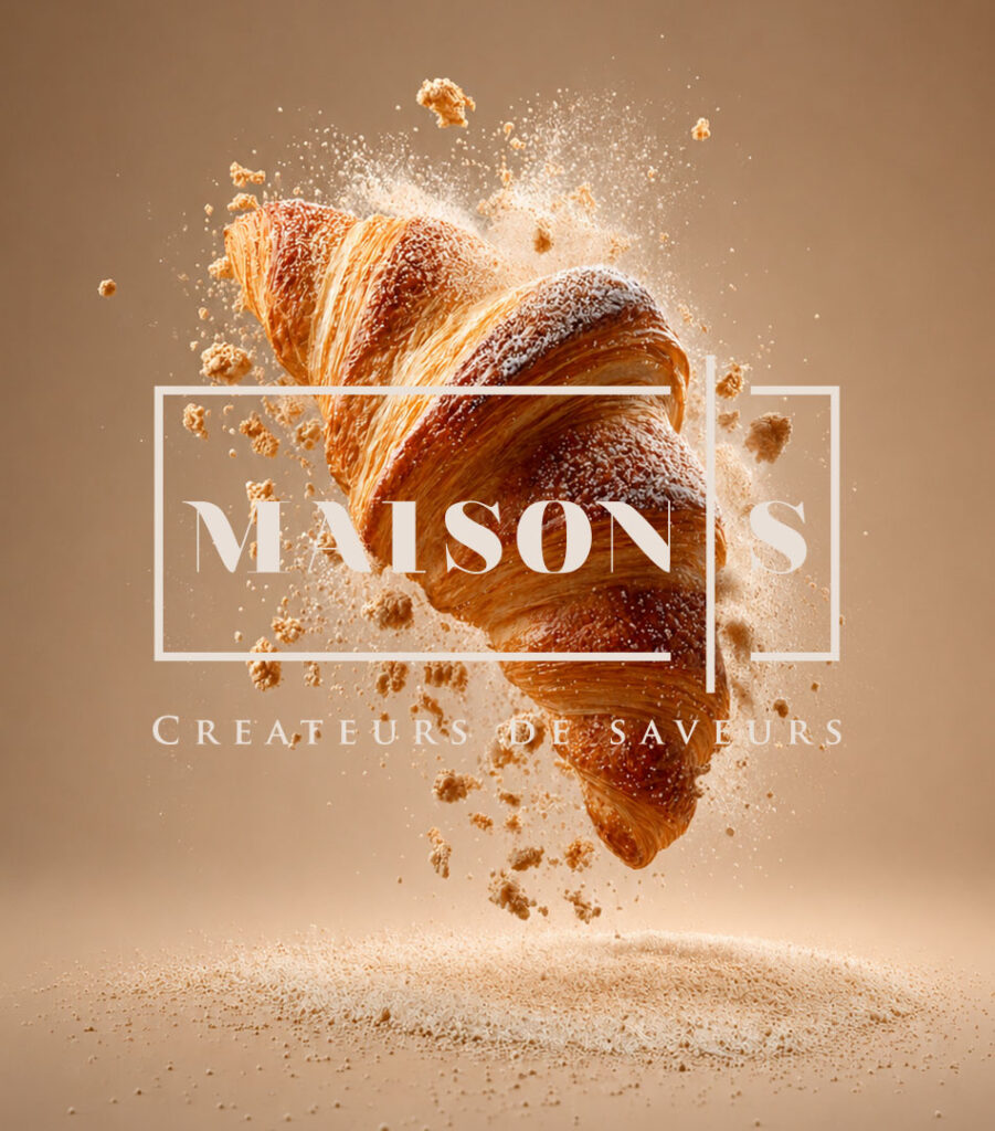
The Logo
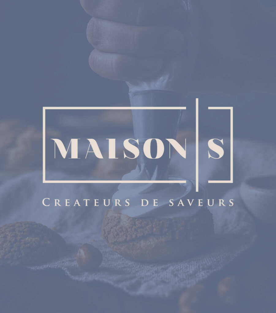
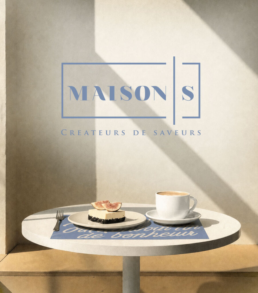
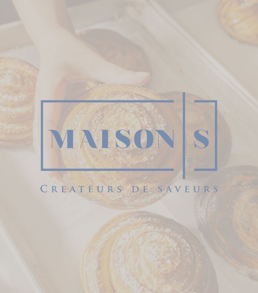
The logo is built around a refined serif wordmark enclosed within a delicate geometric frame.
The word MAISON occupies the main space, while the S is placed inside its own smaller frame. Separating the initial gives it the character of a signature—something personal that completes the name without competing with it.
The open sections of the frame keep the composition light. Rather than enclosing the wordmark completely, the lines create space around it. They can be read as a window, a display case or even the carefully folded edges of a pastry box.
The geometry gives the logo structure, while the typography brings elegance.
Underneath it sits the line:
CRÉATEURS DE SAVEURS
It defines the brand as more than a bakery. Maison S is not only preparing familiar products; it is creating flavours and experiences around them.
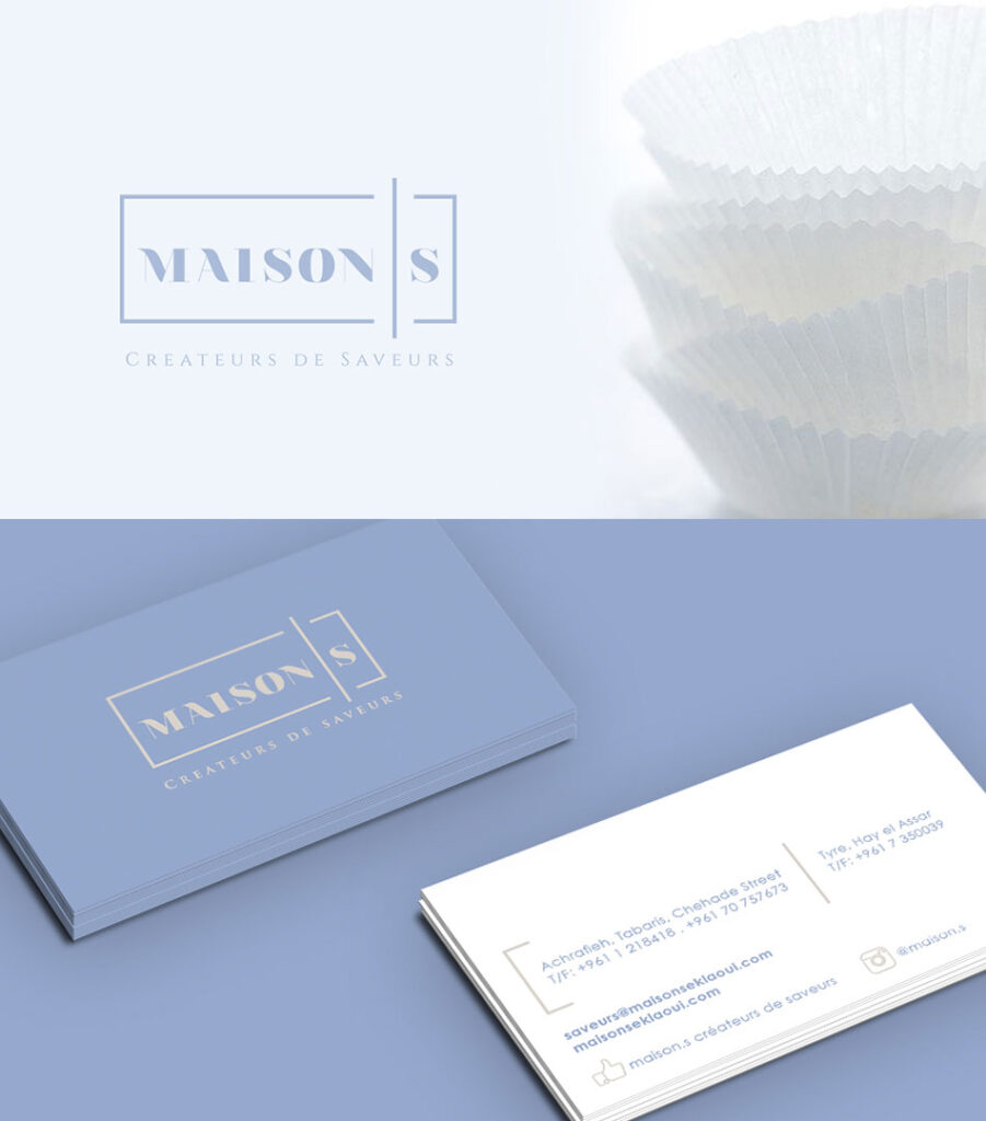
The Colour Palette
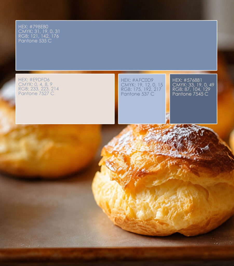
Powder blue became the defining colour of Maison S.
It feels calm, distinctive and slightly unexpected in a category often dominated by brown, cream, pink or gold. Against the warm colours of bread, chocolate and pastry, the blue creates a beautiful contrast and allows the products to remain the visual focus.
Soft cream adds warmth and takes the place of a colder, brighter white. Beige and natural bakery tones support the palette through backgrounds, paper and interior materials.
Together, the colours create a world that feels premium without becoming formal.
Soft, but recognizable.
Elegant, but still inviting.
Two Typographic Personalities
The identity uses typography to express two sides of Maison S.
The serif typeface used in the logo brings refinement, balance and a connection to classic French patisserie. It gives the brand a more composed and timeless presence.
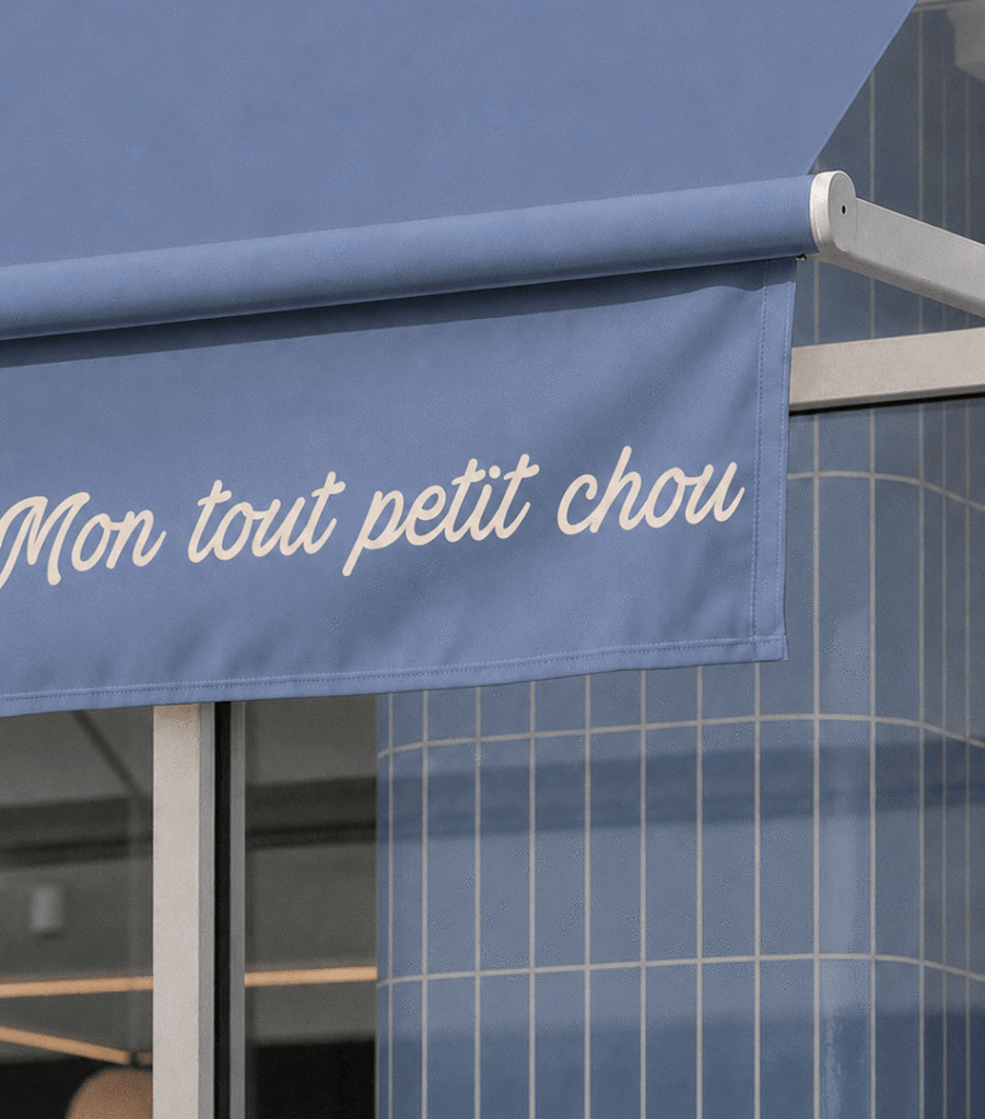
The handwritten script introduces the opposite energy. It is expressive, generous and sometimes a little dramatic. It appears across bags, boxes, cups, window awnings and social content, speaking to customers in a much more personal voice.
One typeface presents the Maison.
The other tells you what it is thinking.
A French Voice with Personality
French is used throughout the identity not simply as a reference to patisserie, but as the brand’s voice.
The messages turn familiar products into small observations about daily life:
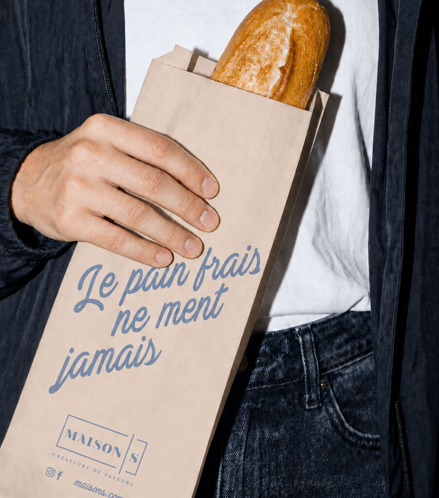
Le pain frais ne ment jamais.
Fresh bread never lies.
Mon tout petit chou.
My little sweetheart—and, conveniently, also a pastry.
Un peu de sucre, beaucoup d’amour.
A little sugar, a lot of love.
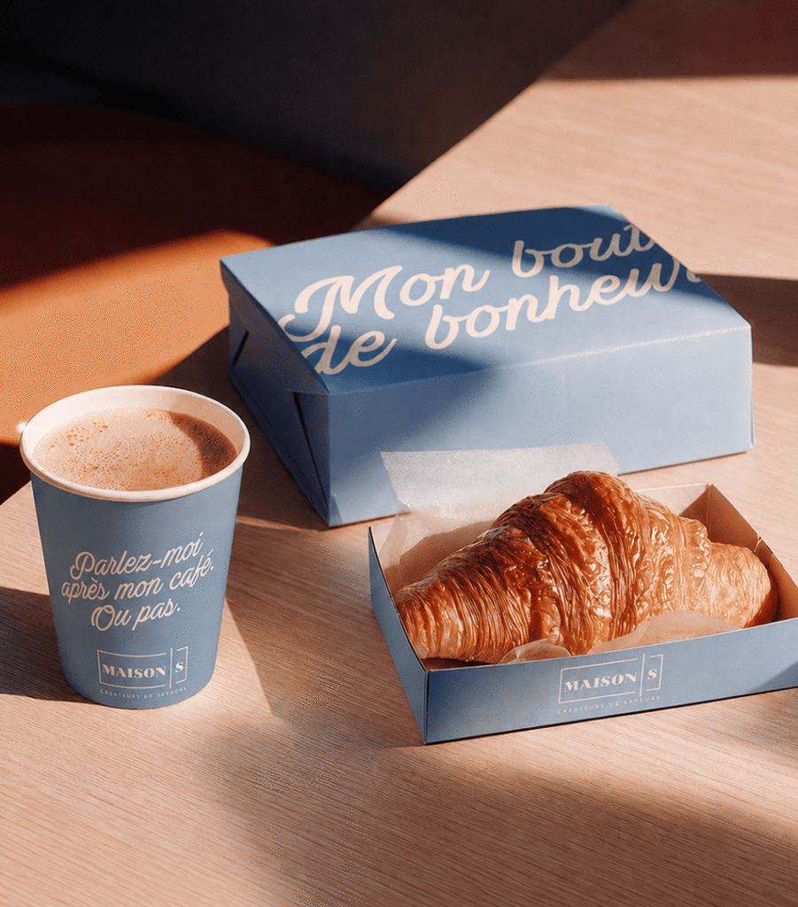
Parlez-moi après mon café. Ou pas.
Talk to me after my coffee. Or don’t.
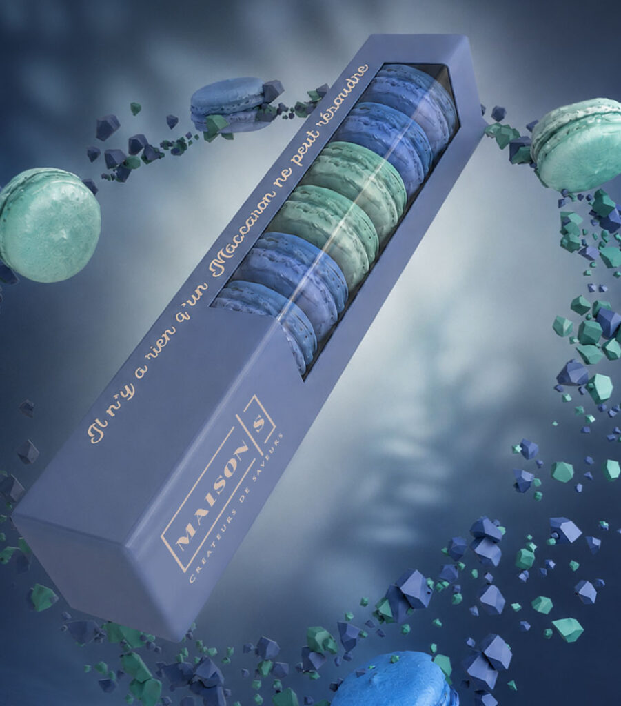
Il n’y a rien qu’un macaron ne peut résoudre.
There is nothing a macaron cannot fix.
Ici, le bonheur se mesure en tranches.
Here, happiness is measured in slices.
The humour is gentle and familiar. It does not try too hard to be clever. It simply understands that people often have surprisingly strong emotional relationships with coffee, bread and dessert.
Maison S speaks to those people.
Which is most people.
Packaging
Packaging is where the brand becomes part of the customer’s day.
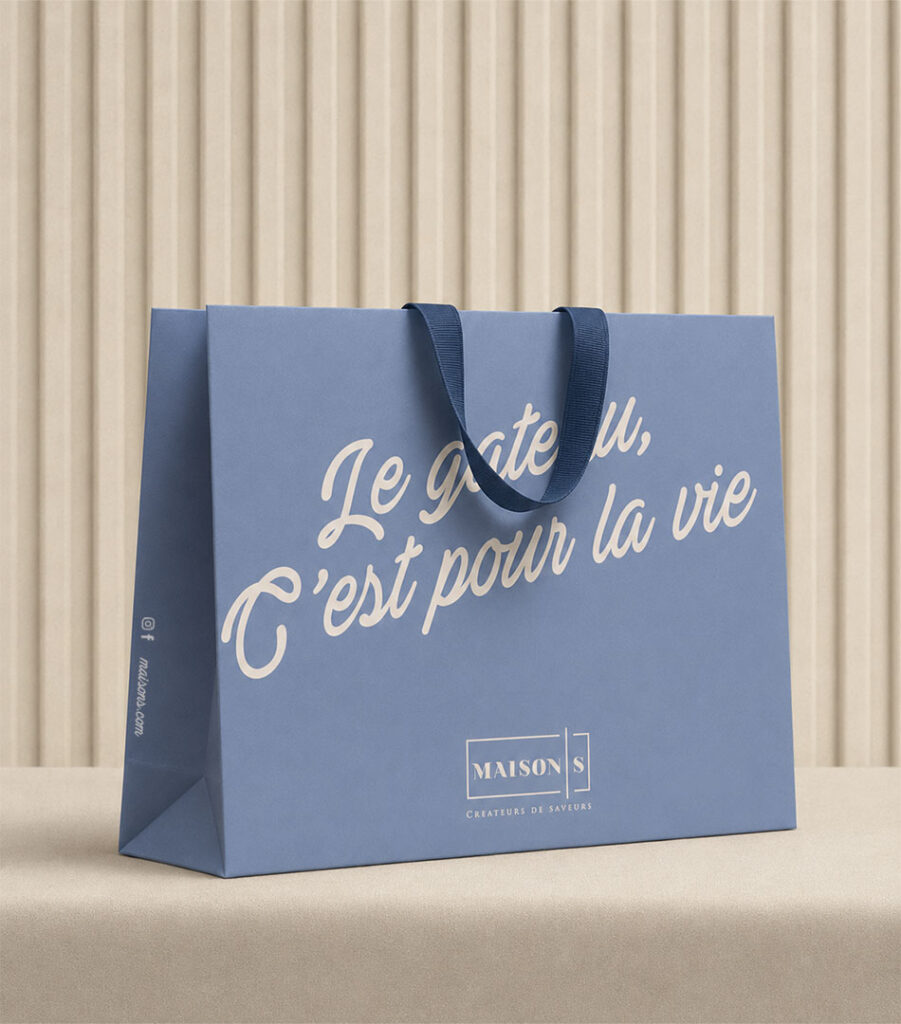
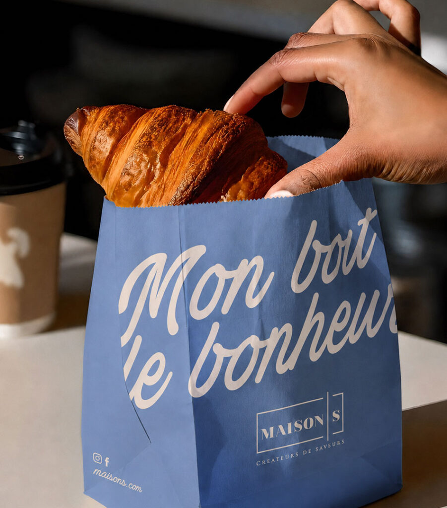
Large shopping bags use generous areas of powder blue with oversized handwritten statements. The logo remains smaller and more restrained, allowing the message to lead the composition.
Baguette sleeves use natural paper and statements such as “Le pain frais ne ment jamais,” connecting the personality of the brand directly to the product inside.
Smaller pastry bags carry “Mon bout de bonheur”—my little piece of happiness—turning a simple takeaway item into something more personal.
The system is consistent without being repetitive. Each format has its own message, but the colour, typography and tone make everything unmistakably Maison S.
Boxes for Every Kind of Happiness
Different products were given packaging suited to their shape and personality.
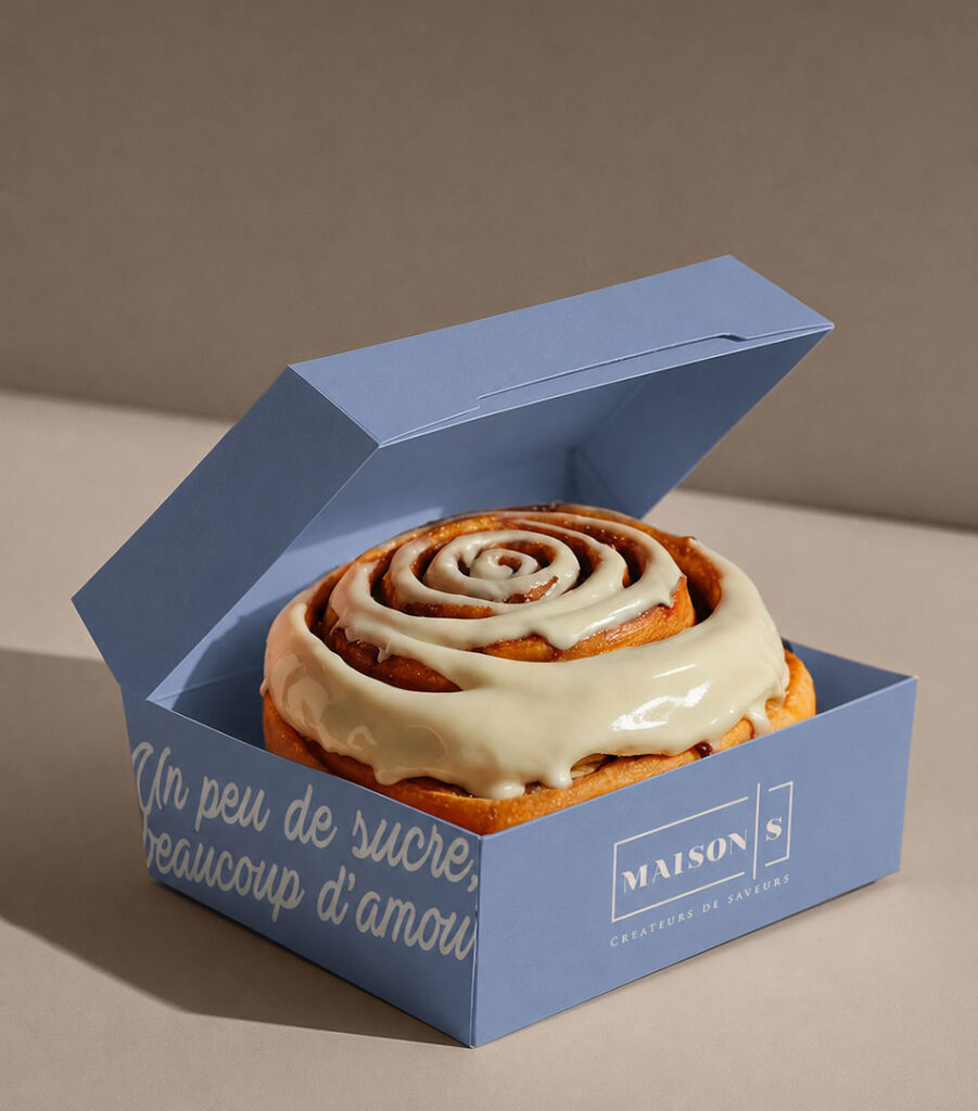
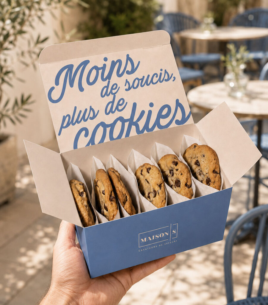
Long macaron boxes use a viewing window that places the colour and precision of the macarons at the centre. The phrase running along the edge treats them as a perfectly reasonable solution to almost any problem.
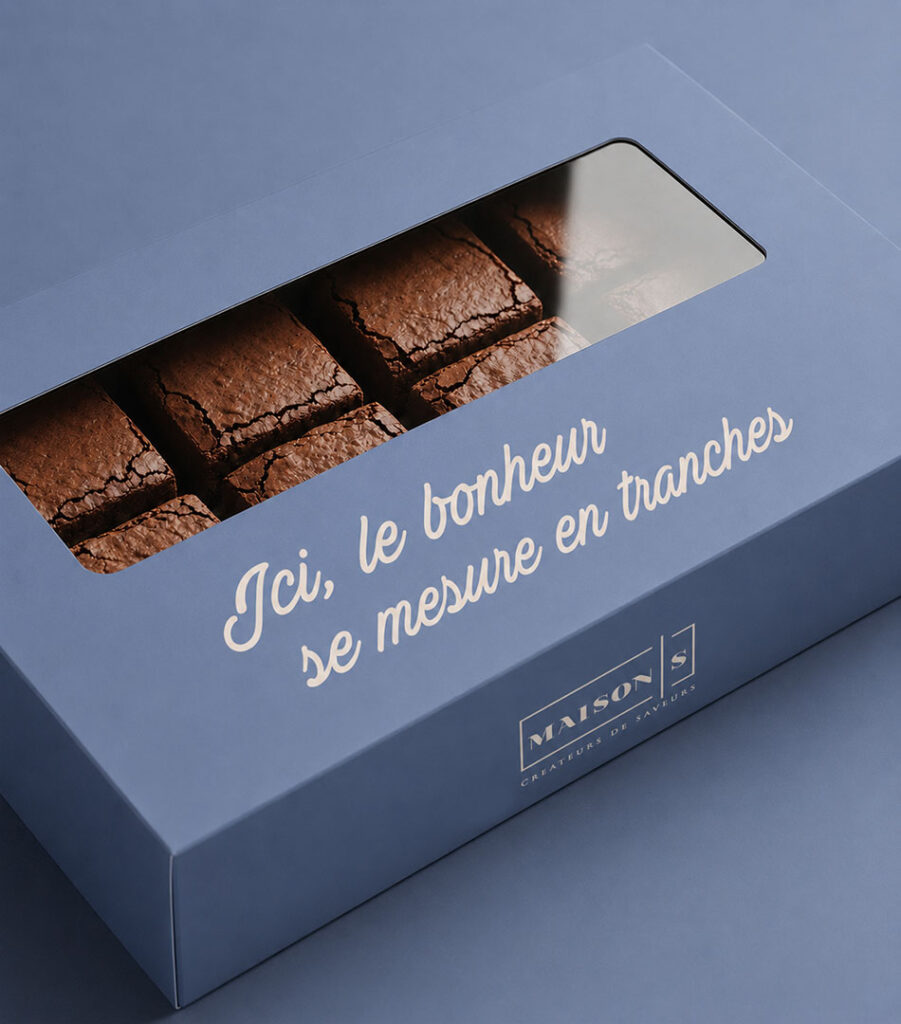
Individual pastry boxes keep the presentation simple and elegant, while larger boxes for brownies and assorted sweets use statements that change according to what is inside.
A cinnamon roll arrives with:
Un peu de sucre, beaucoup d’amour.
A box of brownies announces:
Ici, le bonheur se mesure en tranches.
The packaging does more than transport the product. It sets up the experience before the box is opened.
Photography
The photography brings the products close enough to feel almost tangible.
Flaky croissants, glossy fillings, powdered sugar and melting icing are shown with a strong focus on texture. The lighting is warm and natural, allowing each pastry to feel freshly made rather than overly styled.
Some images are quiet and intimate. Others are much more expressive, a croissant suspended in the air, crumbs and flour exploding around it as though breakfast has suddenly become an event.
The products remain beautiful, but never precious.
They are still meant to be eaten.
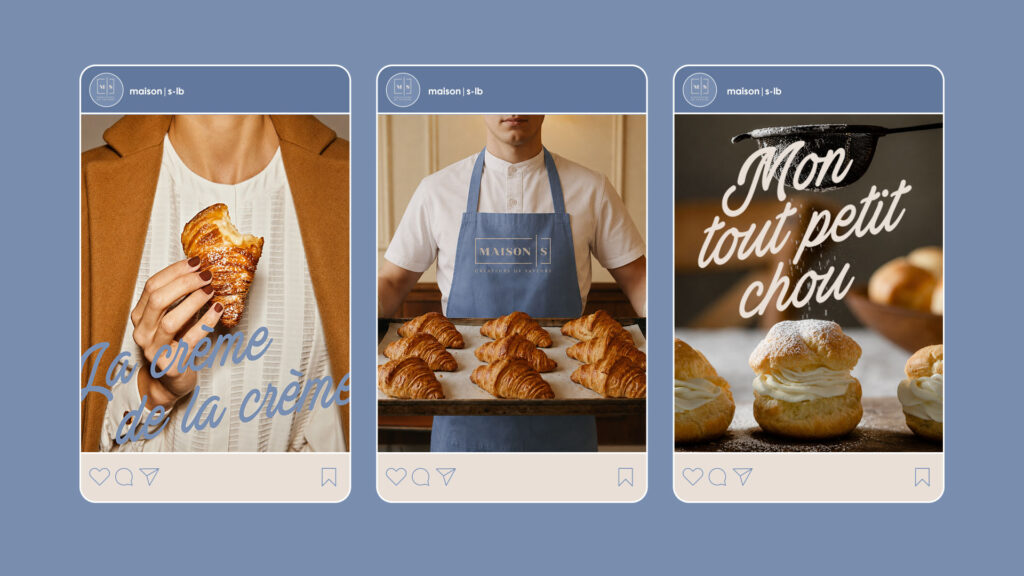
Social Media
Social content extends the same balance of product and personality.
Some posts focus entirely on craftsmanship: trays of croissants, freshly baked pastries or the people behind them. Others bring in the handwritten statements, allowing the brand to comment on cravings, coffee and the emotional importance of dessert.
The layouts remain clean enough for the food to lead, while the powder blue provides immediate recognition throughout the feed.
Rather than making every post look identical, the system creates a recognizable atmosphere.
The People Behind the Maison
The identity also extends naturally to the team.
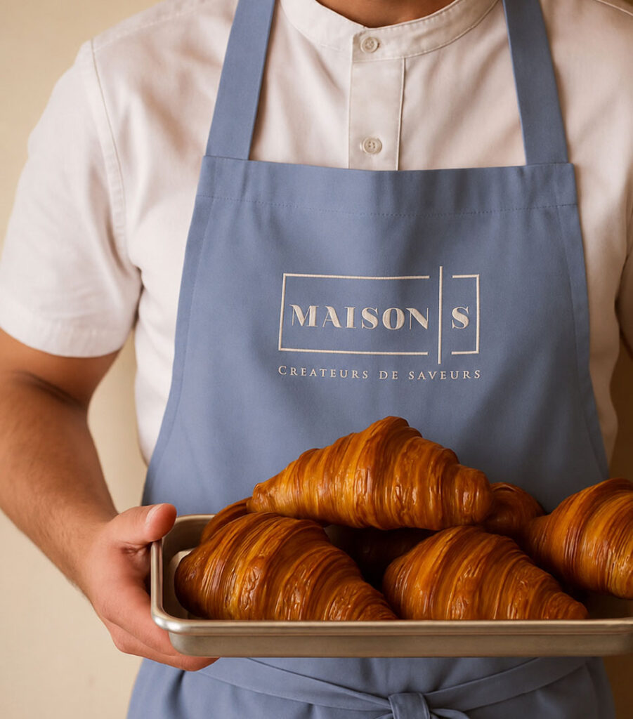
Powder blue aprons bring the brand colour into the bakery, paired with simple white uniforms and the framed logo. The look feels professional without becoming too formal.
Photography of the staff adds warmth to the more refined elements of the identity. It reminds customers that behind every precise layer of pastry is someone folding dough, filling boxes, serving coffee and probably waking up much earlier than everyone else.
The word Maison means house.
The people are what make it one.
The Experience
From exterior awnings and takeaway cups to pastry paper and staff uniforms, the identity was designed to make every touchpoint feel connected.
The blue tiles, warm lighting and restrained interior materials create a setting that supports the products rather than competing with them. French phrases appear in unexpected places, giving customers small moments to discover as they move through the space.
A cup might tell you not to speak before coffee.
A box may insist that cake is for life.
It is difficult to argue with either.
The Brand
Maison S brings together two qualities that do not always appear side by side: elegance and affection.
The logo gives the brand structure.
The blue makes it recognizable.
The products make it desirable.
And the language makes it feel human.
The result is a Beirut bakery and patisserie that treats flavour seriously, but never forgets the joy surrounding it.
Maison S.
Créateurs de saveurs.