
There comes a point in almost every logo project where the letters stop behaving like letters and start behaving like people.
Lettters suddenly have too much attitude, others feels awkward for no obvious reason. We know how ridiculous that sounds, but after spending hours drawing, redrawing and adjusting letterforms, it’s impossible not to give them personalities.
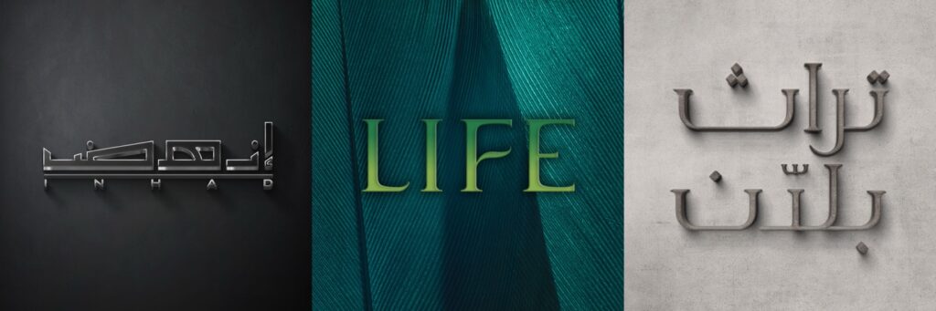
Type design has a strange way of doing that to you.
Most people imagine the process as sitting in front of a computer, choosing a font and making it look nice. We wish it were that simple. In reality, it’s closer to solving a puzzle where every piece keeps changing shape. One small adjustment improves one letter and somehow annoys the one next to it. Fix that one, and another decides it’s no longer happy. It’s a wonderfully frustrating cycle.
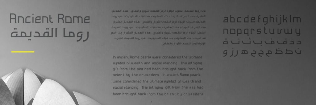
Our studio has had surprisingly serious conversations about things that would sound completely absurd anywhere else. “That ‘E’ feels tired.”, “The ‘A’ is trying too hard.”, “Can we make the ‘G’ a little less dramatic?”. Oddly enough, everyone in the room knows exactly what those comments mean. That’s because type design isn’t only about precision. It’s about character. Every curve, every angle and every tiny adjustment changes the personality of a word. Sometimes the difference is so subtle that nobody outside the studio will ever notice it. That’s perfectly fine. The goal isn’t for people to admire the letters. The goal is for them to remember the brand. One of the things we love most about designing logo types is that no two projects ever ask the same questions. Some names need elegance. Others need confidence. Some want to feel playful without becoming childish. Others need authority without looking cold. Every word brings its own challenge, and every letter has an opinion about how it wants to be drawn. One thing we’ve learned over the years is that clients almost never ask for “better typography.” They ask for confidence. Trust. Luxury. Energy. Simplicity. Typography just happens to be one of the quietest ways to communicate all of those things. That’s why we find it funny when people call type “just the font.” Calling typography “just the font” is a bit like calling architecture “just the bricks.”
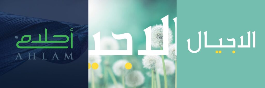
Then comes spacing.
If letters had therapists, spacing would probably be the reason.
Move two characters half a millimetre closer and suddenly they’re best friends. Push them slightly apart and now they’re refusing to speak to each other. It’s amazing how something so small can completely change the way a logo feels, even if nobody can explain why.
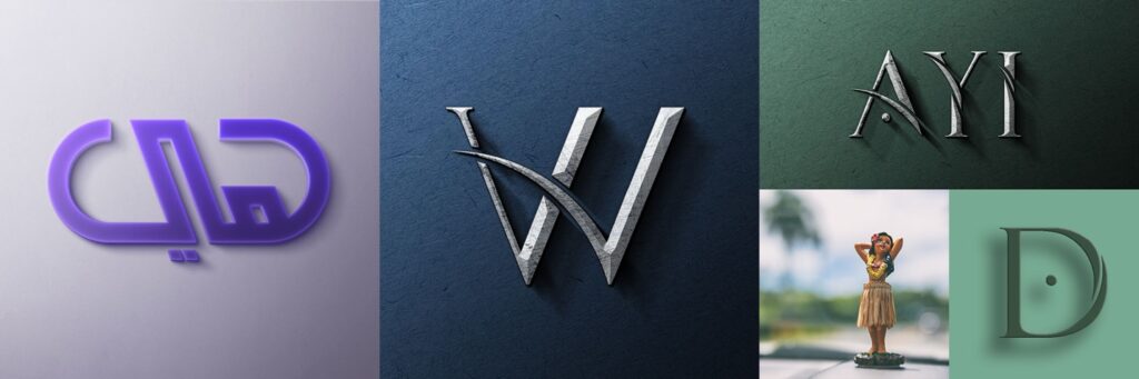
There’s also a misconception that precision somehow kills creativity. We think it’s the opposite. Creativity isn’t the absence of precision. It’s knowing exactly which tiny detail is worth obsessing over. Sometimes the difference between a forgettable logo and a memorable one isn’t a dramatic idea. It’s a five-minute adjustment that took fifteen years of experience to recognize.
The work featured throughout this article is a collection of those tiny obsessions. Some letterforms were sketched dozens of times before they felt right. Others came together almost immediately, only to spend the next few days being questioned anyway. That’s part of the process. We don’t expect perfection on the first attempt, and thankfully, neither do the letters.
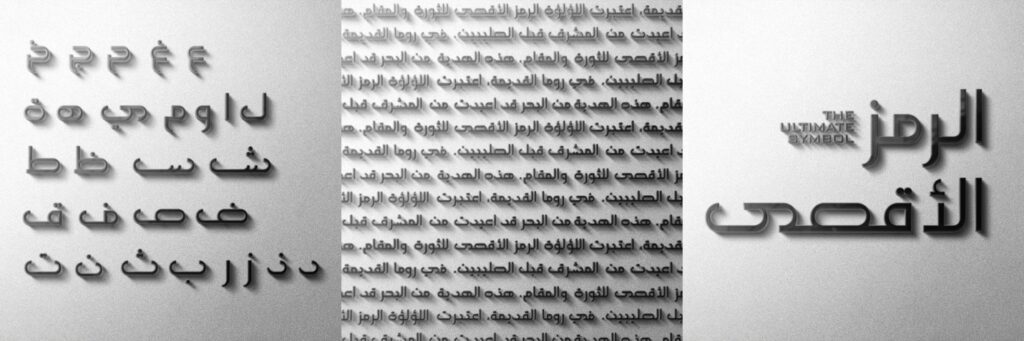
Looking back at these projects, we rarely remember how long they took. We remember the conversations. The debates over a single curve. The moments when one small adjustment suddenly made the entire word come to life. Those are the details that never appear in the final logo, but they’re often the reason the final logo feels effortless.
So yes, we genuinely believe fonts have feelings too.
Not because they’re alive.
But because after spending enough time designing, refining and occasionally arguing with them, it’s very difficult to think of them any other way.