
Lumina Surgical Gynecology was created to redefine how women experience specialized gynecological care. The objective was to develop a brand identity that felt medically credible and highly professional, while avoiding the cold, clinical aesthetic commonly associated with healthcare providers.
The brand needed to communicate expertise, trust, compassion, and innovation simultaneously. Beyond designing a logo, the goal was to build a complete visual ecosystem capable of extending seamlessly across the clinic environment, patient communications, digital platforms, social media, and branded materials.
The Challenge
One of the primary challenges was creating a visual identity that could balance two seemingly opposite qualities: medical precision and emotional warmth.
Women’s healthcare often requires a sense of reassurance, empathy, and comfort, yet the brand also needed to reflect advanced surgical expertise and clinical excellence. The identity had to feel luxurious and refined without becoming decorative, and professional without appearing intimidating.
The visual language also needed to work across a wide range of applications, from large-scale signage and interior environments to mobile interfaces, social media content, printed materials, and merchandise, while maintaining consistency and recognition at every touchpoint.
The Solution
The resulting identity is built around a symbolic mark that brings together multiple layers of meaning.
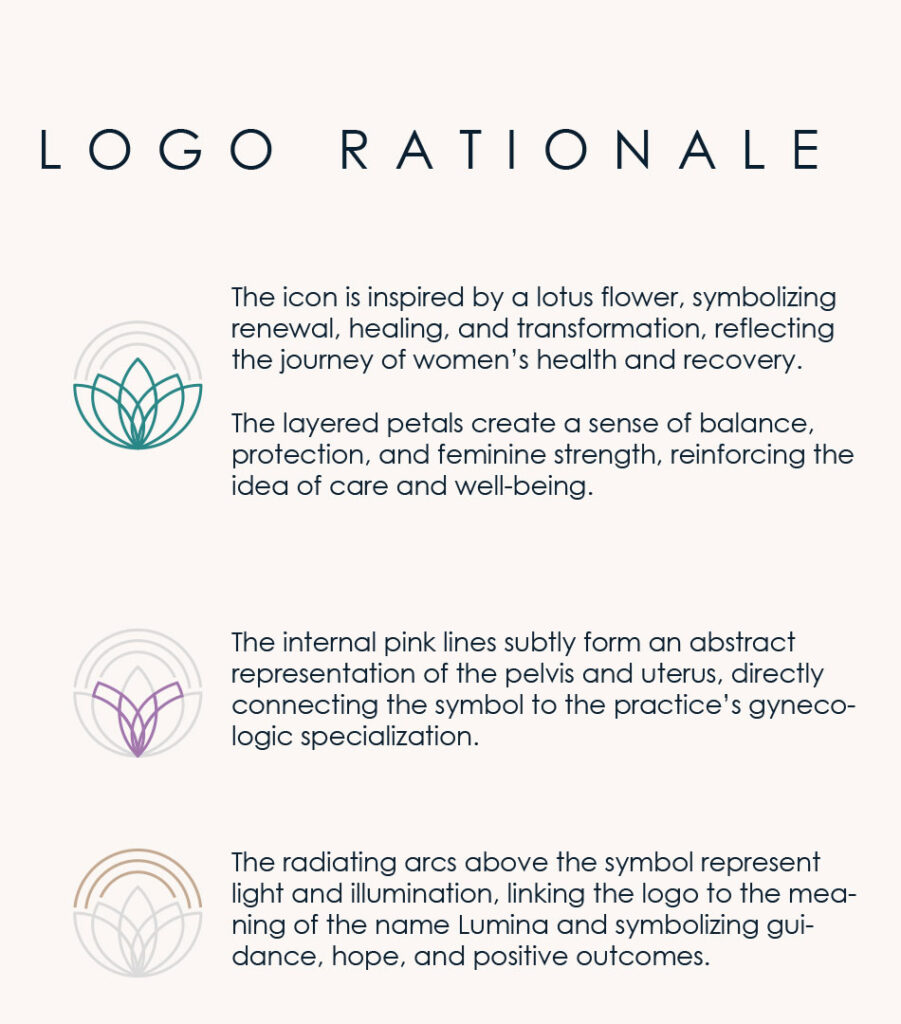
At its core, the logo draws inspiration from the lotus flower, a universal symbol of growth, renewal, and rebirth. The overlapping petals create a sense of balance and harmony while reflecting the journey of healing and transformation.
The inner structure subtly references the female pelvis, creating a meaningful connection to the practice’s specialization without relying on literal medical imagery. This hidden layer adds depth to the symbol while reinforcing the brand’s focus on women’s health.
The three ascending arcs above the mark represent light, illumination, and guidance, the essence behind the name Lumina. Together, these elements create a visual narrative that speaks to expertise, care, empowerment, and hope.
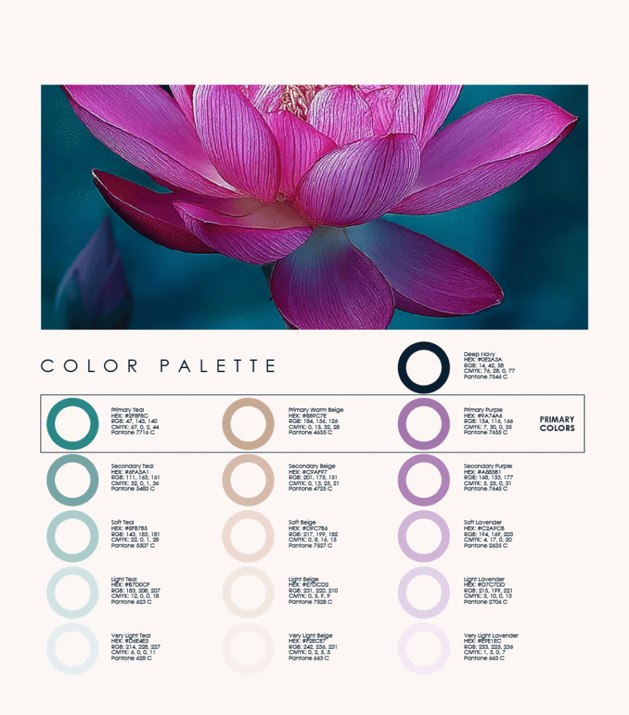
A carefully curated palette of teal, lavender, and warm neutral tones was selected to balance professionalism with softness, creating an atmosphere that feels both premium and welcoming. Every element of the identity was constructed using geometric principles and intentional proportions, ensuring consistency and longevity across all applications.
Social Media
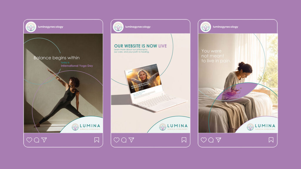
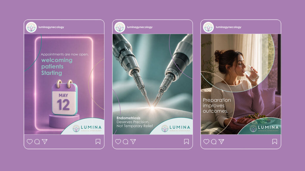
Social media was designed to make complex health information feel clearer and more approachable.
The content system combines educational posts, condition awareness, patient preparation, wellbeing messages, announcements and appointment updates. Medical subjects are presented through direct language and confident imagery, while warmer lifestyle photography acknowledges the emotional and everyday side of women’s health.
Curved graphic elements taken from the logo connect each post to the identity, while teal and lavender help distinguish information and maintain consistency across the feed. The result feels informative and credible without becoming overly clinical.
The Patient Application
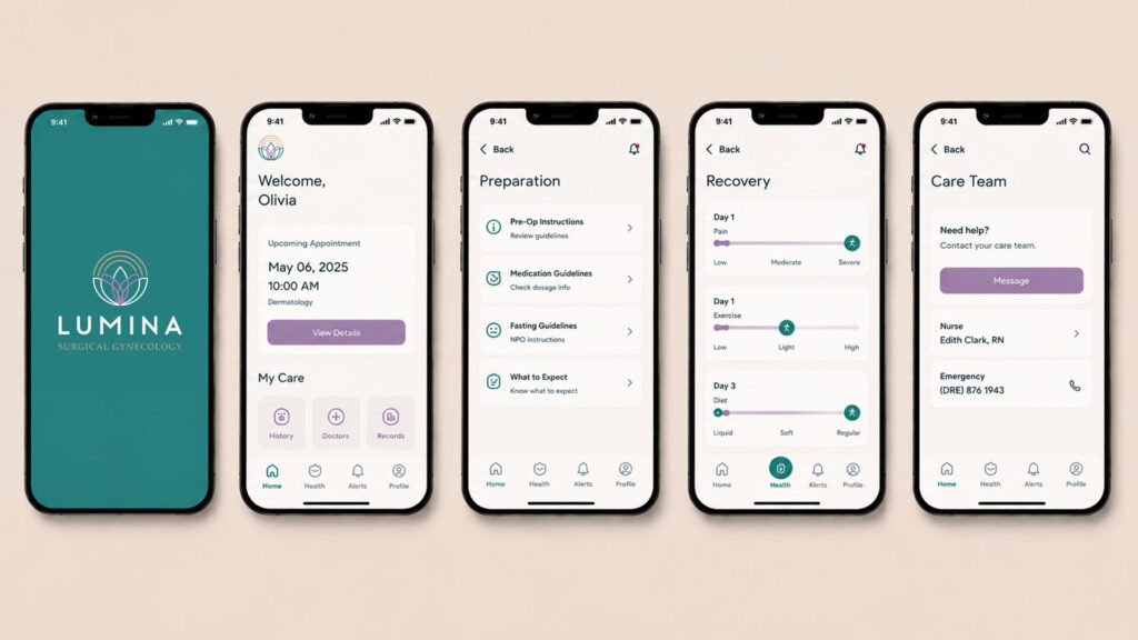
The mobile application extends Lumina’s care beyond the clinic.
Patients can view upcoming appointments, access medical records, review pre-operative and medication instructions, understand what to expect and stay connected with their care team. Recovery tools help patients track pain, exercise and diet after a procedure, turning the application into a practical companion throughout the treatment journey.
The interface uses clear navigation, generous spacing and soft colours to make important information easy to understand, particularly at moments when patients may already feel anxious or overwhelmed.
The Clinic Experience
The identity carries naturally into the physical environment.
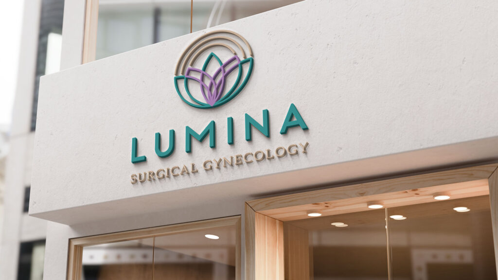
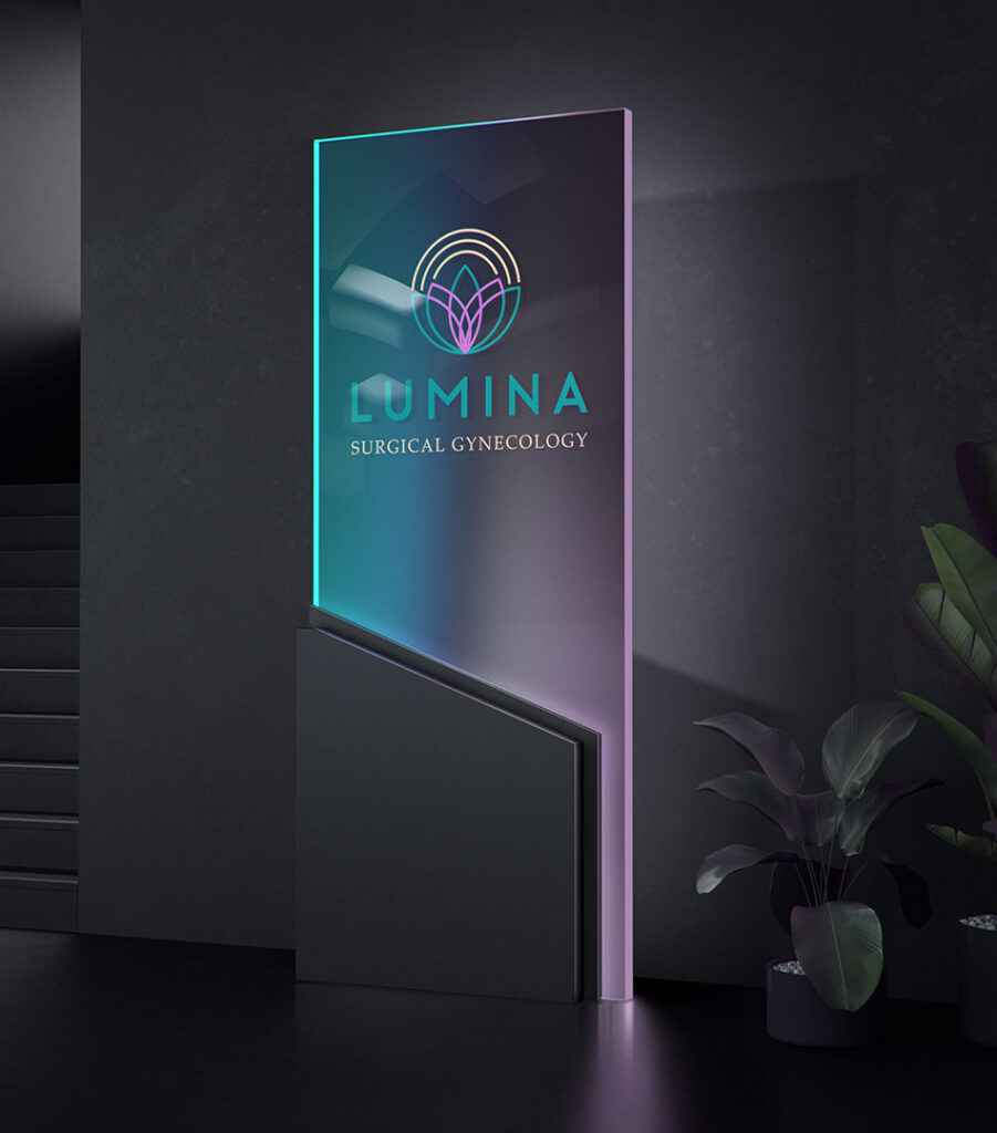
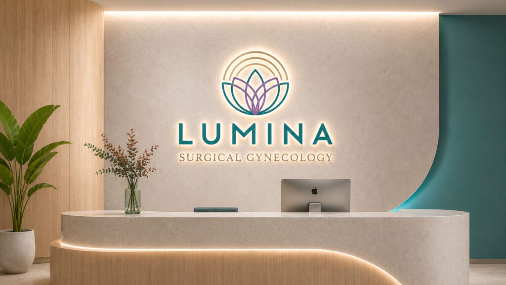
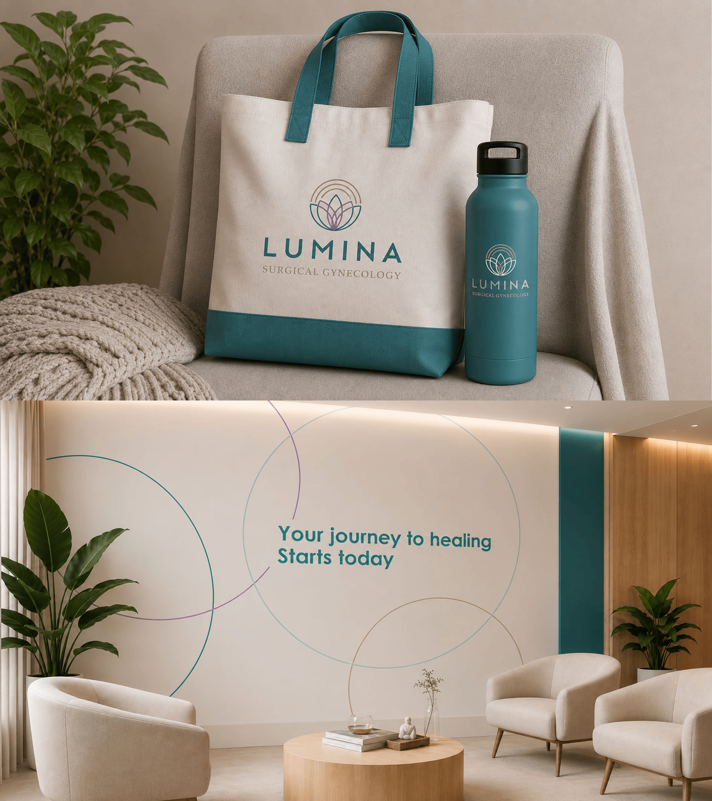
Warm wood, soft lighting, curved architectural details and neutral surfaces create a reception area that feels calm and welcoming. The illuminated logo becomes a focal point without making the space feel corporate or institutional.
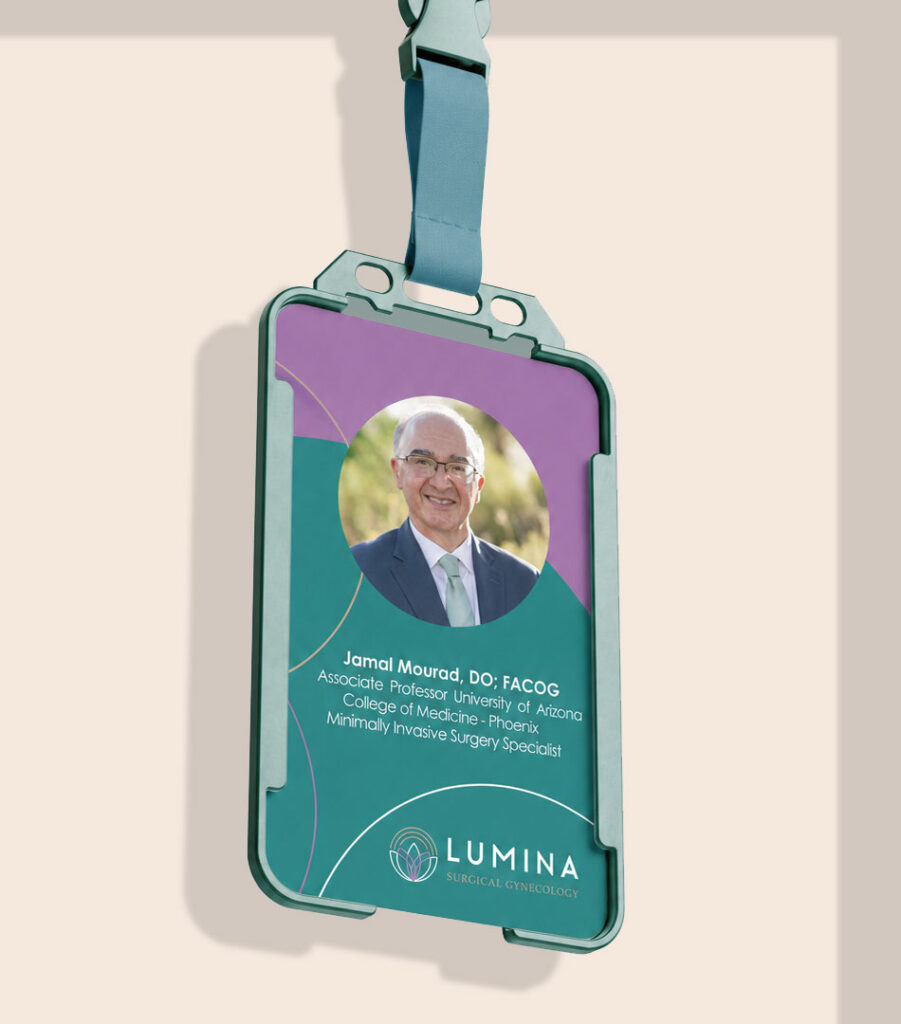
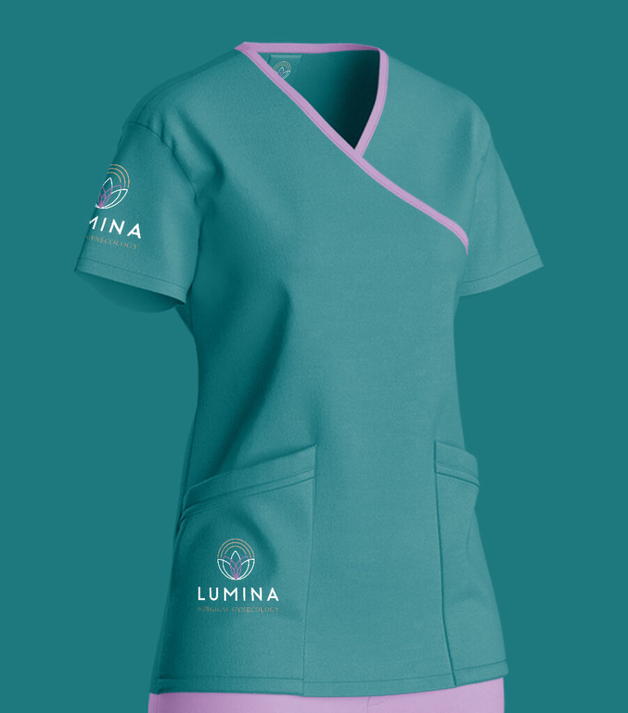
Staff uniforms use teal with lavender details, helping the medical team appear professional while remaining visually connected to the softer character of the brand.
Promotional and patient-care items were designed as useful extensions of the experience rather than simple giveaways.
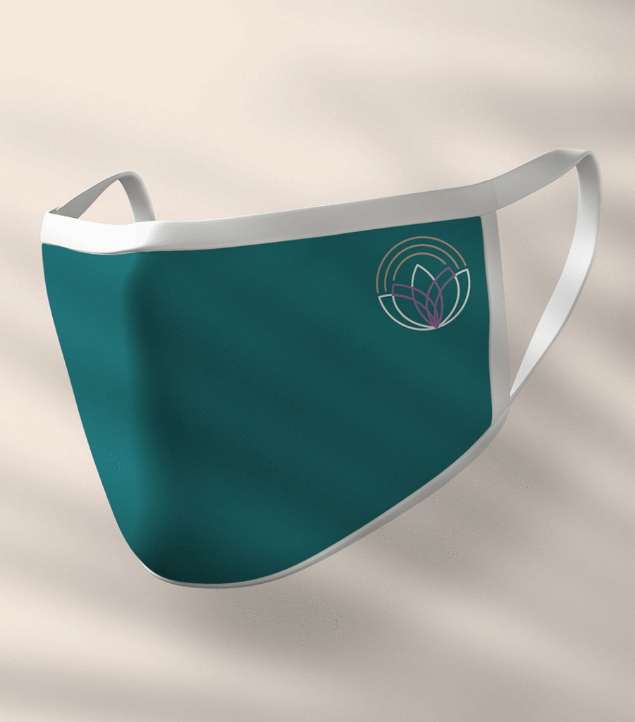
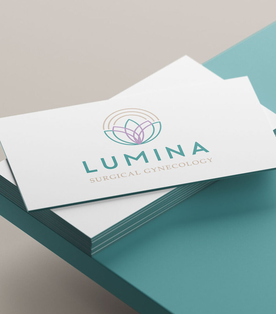
Branded tote bags, reusable bottles and face masks carry the identity into everyday life, while business cards and staff materials maintain a more refined and professional presentation. Each item uses the same restrained palette and recognizable symbol, strengthening the brand without making the applications feel overly promotional.
The Outcome
The final result is a complete brand system that positions Lumina as more than a medical practice.
From the clinic environment and staff uniforms to social media, patient technology and practical branded items, every touchpoint supports the same promise: advanced surgical care delivered with clarity, compassion and respect.